Accordion
The accordion.
This uses Scot Ohara' accessible accordion.
This github page has some good docs:
https://github.com/scottaohara/a11y_accordions
All data-aria-accordion- items are required by the js.
The js lives in the libraries/a11y-accordion folder.
Be sure to test all changes in html. Inserting html wrappers
is known to break the a11y_accordions plugin.
Qui ipsorum lingua Celtae, nostra Galli appellantur.
Morbi odio eros, volutpat ut pharetra vitae, lobortis sed nibh.
- Markup Details
-
                            {{ attach_library('goizueta_theme/accordion') }}

{# Preserve the Drupal attributes if they're available. #}
{%
  set attributes = attributes ? attributes.addClass('accordion-container') : ' class="accordion-container"'
%}

<section {{ attributes|raw }}>
  {% block heading %}
    {% include '@components/heading/heading.twig' with {
      "heading" : accordion.heading
    } only %}
  {% endblock %}
  <div class="accordion" data-aria-accordion="" {% if accordion.first_open %} data-constant=""{% endif %}>
    {% for item in accordion.accordion_items %}
      <h3 data-aria-accordion-heading="" class="accordion__heading">
        <button type="button" id="{{ item.id}}_trigger" class="accordion__trigger">
          {{ item.title }}
        </button>
      </h3>
      <div data-aria-accordion-panel="" id="{{ item.id }}"  class="accordion__panel">
        {{ item.body }}
      </div>
    {% endfor %}
  </div>
</section>
Admission Dates
The Admission Dates component.
Admission Deadlines
- Application Deadline
- Notification
- Deposit Due
-
Round 1Application Deadline
September 11, 2024
NotificationOctober 9, 2024
Deposit DueOctober 30, 2024
-
Round 2Application Deadline
October 23, 2024
NotificationNovember 20, 2024
Deposit DueDecember 4, 2024
-
Round 3Application Deadline
January 6, 2025
NotificationMarch 12, 2025
Deposit DueApril 9, 2025
-
Round 4Application Deadline
March 5, 2025
NotificationMarch 26, 2025
Deposit DueApril 9, 2025
-
Round 5Application Deadline
April 9, 2025
NotificationApril 18, 2025
Deposit DueApril 24, 2025
-
Round 6Application Deadline
April 24, 2025
NotificationMay 26, 2025
Deposit DueJune 9, 2025
- Markup Details
-
                            {{ attach_library('goizueta_theme/admission-dates') }}
{% import '@components/icons/icons.twig' as icons %}

{%
  set attributes = attributes ? attributes.addClass('admission-dates') : ' class="admission-dates"'
%}

<section{{ attributes|raw }}>
  <div class="admission-dates__content">
  {% if heading %}
      {% block heading %}
        {% include '@components/heading/heading.twig' with {
          "heading" : heading
        } only %}
    {% endblock %}
  {% endif %}

  {% if intro_text %}
    <div class="admission-dates__intro">
      {% include '@components/body-text/body-text.twig' with {
        "body_text" : intro_text
      } only %}
    </div>
  {% endif %}

  {% if labels or items %}
    <div class="admission-dates__table-wrapper">
      {% if labels %}
        <ul class="admission-dates__labels">
          {% for label in labels %}
            <li class="admission-dates__labels--item">
              <span class="labels--icon">
                {{ icons.get(label.icon, 'icon--' ~ label.icon) }}
              </span>
              <span class="labels--text">{{ label.text }}</span>
            </li>
          {% endfor %}
        </ul>
      {% endif %}
      {% if items %}
        <ul class="admission-dates__items">
          {% for item in items %}
            <li class="admission-dates__row">
              {%
                include '@components/admission-dates/admission-dates-item.twig' with {
                  "title": item.title,
                  "deadline": item.deadline,
                  "notifications": item.notifications,
                  "deposit": item.deposit
                } only
              %}
            </li>
          {% endfor %}
        </ul>
      {% endif %}
    </div>
  {% endif %}
    {% if note %}
    <div class="admission-dates__note">{{ note }}</div>
    {% endif %}
  </div>
</section>
Admission Dates Item
The Admission Dates Item component.
- Markup Details
-
                            {{ attach_library('goizueta_theme/admissin-dates-item') }}
{% import '@components/icons/icons.twig' as icons %}

<article class="admission-dates__list">
  {% if title %}
    <div class="admission-dates__item admission-dates__item--first">
      <button class="admission-dates__toggle">
        {{ title }}
      </button>
      <span class="admission-dates__item--table-heading">
        {{ title }}
      </span>
    </div>
  {% endif %}
  {% if deadline %}
    <div class="admission-dates__item">
      <span class="admission-dates__label">
        {{ icons.get('clock-square', 'icon--deadline')}}
        {{ 'Application Deadline'|t }}
      </span>
      <span class="admission-dates__content">
        {{ deadline }}
      </span>
    </div>
  {% endif %}
  {% if notifications %}
    <div class="admission-dates__item">
      <span class="admission-dates__label">
        {{ icons.get('bell', 'icon--notification')}}
        {{ 'Notification'|t }}
      </span>
      <span class="admission-dates__content">
        {{ notifications }}
      </span>
    </div>
  {% endif %}
  {% if deposit %}
    <div class="admission-dates__item">
      <span class="admission-dates__label">
        {{ icons.get('deposit', 'icon--deposit')}}
        {{ 'Deposit Due'|t }}
      </span>
      <span class="admission-dates__content">
        {{ deposit }}
      </span>
    </div>
  {% endif %}
</article>
Alert
The alert component displays a title and summary with an optional image.
Summary below is 250 chars
- Markup Details
-
                            {{ attach_library('goizueta_theme/alert') }}

{# Preserve the Drupal attributes if they're available. #}
{% set attributes = attributes ? attributes.addClass('alert') : ' class="alert"' %}

<section {{ attributes|raw }}>
  <div class="alert__inner">
    {% if alert.image %}
      <div class="alert__image">{{ alert.image }}</div>
    {% endif %}
    <div class="alert__content">
      <h2 class="alert__title">{{ alert.title }}</h2>
      <div class="alert__summary">{{ alert.summary }}</div>
    </div>
  </div>
</section>
Body Text
The Body Text component is simple way for displaying plain body text.
- Markup Details
-
                            {{ attach_library('goizueta_theme/body-text') }}

{%
  set attributes = attributes ? attributes.addClass('body-text') : ' class="body-text"'
%}

{% if body_text %}
  <div{{ attributes|raw }}>
    {% block body_text %}
      {{ body_text }}
    {% endblock %}
  </div>
{% endif %}
Breadcrumbs
Site breadcrumbs.
- Markup Details
-
                            {% import "@components/icons/icons.twig" as icons %}

{# Preserve the Drupal attributes if they're available. #}
{% set breadcrumb_class = ['breadcrumbs', breadcrumbs.modifier_class] %}
{%
  set attributes = attributes ? attributes.addClass(breadcrumb_class) : ' class="' ~ breadcrumb_class|join(' ') ~ '"'
%}
{# If we don't use |raw twig.js tries to escape the quotes on the class attribute. #}
{% if breadcrumbs.items %}
  <nav{{ attributes|raw }} role="navigation" aria-labelledby="system-breadcrumb">
    {% block breadcrumb %}
      <h2 id="system-breadcrumb" class="visually-hidden">{{ 'Breadcrumb'|t }}</h2>
      <ol class="breadcrumb-trail">
      {% for item in breadcrumbs.items %}
        <li class="breadcrumb-trail--item">
          {% if not loop.last %}
            <a href="{{ item.url }}">{{ item.title }}</a>
            {{ icons.get('arrow-brown', '') }}
          {% else %}
            {% if item.url %}
              <a href="{{ item.url }}">{{ item.title }}</a>
            {% else %}
              {{ item.title }}
            {% endif %}
          {% endif %}
        </li>
      {% endfor %}
      </ol>
    {% endblock %}
  </nav>
{% endif %}
Breaker
The Breaker component displays a title, button, summary text, an optional image.
The two variations of the breaker depend on whether an image is uploaded or not. If no image is provided the text and CTA are displayed in the middle of the breaker. When an image is provided, the image is displayed in place of the text and CTA and these are then moved down below the blue background.

- Markup Details
-
                            {# Breaker with no image and 2 CTAs. #}
<section style="margin-top: 100px;">
  {% include '@components/breaker/breaker.twig' with {
    "heading": item_no_image.heading,
    "sub_heading": item_no_image.sub_heading,
    "text": item_no_image.text,
    "cta_1": item_no_image.cta_1,
    "cta_2": item_no_image.cta_2
  } only %}
</section>

{# Breaker with image and 2 CTAs. #}
<section style="margin-top: 100px;">
  {% include '@components/breaker/breaker.twig' with {
    "heading": item_with_image.heading,
    "sub_heading": item_with_image.sub_heading,
    "text": item_with_image.text,
    "image": item_with_image.image,
    "cta_1": item_with_image.cta_1,
    "cta_2": item_with_image.cta_2
  } only %}
</section>

{# Breaker with video and custom background and 1 CTA. #}
<section style="margin-top: 100px;">
  {% include '@components/breaker/breaker.twig' with {
    "heading": item_with_image.heading,
    "sub_heading": item_with_image.sub_heading,
    "text": item_with_image.text,
    "video": item_with_image.video,
    "cta_1": item_with_image.cta_1
  } only %}
</section>
Brochure Form
This is the Brochure Form component which allows visitors to request a program's brochure.
- Markup Details
-
                            {{ attach_library('goizueta_theme/brochure-form') }}

<div class="brochure-form">
  <form action="/">
    <div class="brochure-form__name">
      <div class="brochure-form__name--first">
        <label for="first_name">First name*</label>
        <input id="first_name" type="text" placeholder="Your first Name">
      </div>
      <div class="brochure-form__name--last">
        <label for="last_name">Last name*</label>
        <input id="last_name" type="text" placeholder="Your last Name">
      </div>
    </div>

    <div class="brochure-form__email">
      <label for="email">Email address*</label>
      <input id="email" type="email" placeholder="Your email address">
    </div>
    <div class="brochure-form__program">
      <label for="program-list">Select a program</label>
      <select
        id="program-list"
        name="program-select"
        class="program-select">
        <option value="Option 1">Option one</option>
        <option value="Option 1">Option two</option>
        <option value="Option 1">Option three</option>
        <option value="Option 1">Option four</option>
      </select>
    </div>
    <div class="brochure-form__button">
      {% include '@components/button/button.twig' %}
    </div>
  </form>
</div>
Buttons
This is the button component. It provides basic styles for buttons throughout the site.
disabled attribute. The disabled attribute is the preferred method.
- Markup Details
-
{% import '@components/icons/icons.twig' as icons %} {% if modifier_class == 'button--ghost' %} <div style="padding: 4rem; background-color: #0C2340;color: #fff;"> {# Render as <a>. #} <p>As a link: <a></p> <div> <a href="{{ button.url }}" class="button {{ modifier_class }} {{ button.classes|default('') }}" {{ modifier_class == 'is-disabled' ? ' disabled' }}> <div class="button--inner{{ button.icon is not empty ? ' has-icon' }}"> <span class="button__text"> {{ button.text }} </span> {% if button.icon %} <span class="button__icon"> {{ icons.get(button.icon, 'icon--' ~ button.icon) }} </span> {% endif %} </div> </a> </div> {# Render as <button>. #} <p style="margin: 2rem 0 1rem;">As a button: <button></p> <div> <button type="{{ button.type|default('submit') }}" class="button {{ modifier_class }} {{ button.classes|default('') }}" {{ modifier_class == 'is-disabled' ? ' disabled' }}> <div class="button--inner{{ button.icon is not empty ? ' has-icon' }}"> <span class="button__text"> {{ button.text }} </span> {% if button.icon %} <span class="button__icon"> {{ icons.get(button.icon, 'icon--' ~ button.icon) }} </span> {% endif %} </div> </button> </div> </div> {% else %} {# Render as <a>. #} <p>As a link: <a></p> <div> <a href="{{ button.url }}" class="button {{ modifier_class }}{{ button.classes|default('') }}" {{ modifier_class == 'is-disabled' ? ' disabled' }}> <div class="button--inner{{ button.icon is not empty ? ' has-icon' }}"> <span class="button__text"> {{ button.text }} </span> {% if button.icon %} <span class="button__icon"> {{ icons.get(button.icon, 'icon--' ~ button.icon) }} </span> {% endif %} </div> </a> </div> {# Render as <button>. #} <p style="margin: 2rem 0 1rem;">As a button: <button></p> <div> <button type="{{ button.type|default('submit') }}" class="button {{ modifier_class }} {{ button.classes|default('') }}" {{ modifier_class == 'is-disabled' ? ' disabled' }}> <div class="button--inner{{ button.icon is not empty ? ' has-icon' }}"> <span class="button__text"> {{ button.text }} </span> {% if button.icon %} <span class="button__icon"> {{ icons.get(button.icon, 'icon--' ~ button.icon) }} </span> {% endif %} </div> </button> </div> {% endif %}
Calendar
This is the calendar component.
- Markup Details
-
                            {{ attach_library('goizueta_theme/calendar')}}
<div class="calendar"
  {% if id %}id="{{ id }}"{% endif %}
  {% if settingsName %}data-settingsname="{{settingsName}}"{% endif %}
>
</div>
Card
This is the card component.

- Markup Details
-
                            {{ attach_library('goizueta_theme/card') }}
{% import "@components/icons/icons.twig" as icons %}

{% set program = card.program_name|clean_class %}
{%
  set attributes = attributes ? attributes.addClass('card ' ~ program ~ '')  : ' class="card ' ~ program ~ '"'
%}

<article section {{ attributes|raw }}>
  <div class="card__inner">
    <div class="card__image">
      {{ card.image }}
    </div>
    <div class="card__content">
      <h3 class="card__content--title">
        {{ card.title }}
      </h3>
      <div class="card__content--body">
        {{ card.body }}
      </div>
      {% if card.link.url %}
      <a href="{{ card.link.url }}" class="card__content--link button button--unstyled">
        <div class="button--inner has-icon">
          <span class="button__text">
            {{ card.link.text }}
          </span>
          <span class="button__icon">
            {{ icons.get('arrow-right-black') }}
          </span>
        </div>
      </a>
      {% endif %}
    </div>
  </div>
</article>
Cards Container
This is a listing of program cards which allow for different programs to be compared.


- Markup Details
-
                            {{ attach_library('goizueta_theme/card-container') }}

{# Preserve the Drupal attributes if they're available. #}
{% set component_classes = 'card-container' %}
{% set attributes = attributes ? attributes.addClass(component_classes) : ' class="' ~ component_classes ~ '"' %}

<section {{ attributes|raw }}>
  <div class="card-container__content">
    <div class="card-container__title">
      {% include '@components/heading/heading.twig' with {
        "heading" : heading
      } only %}
    </div>
    <ul class="card-container__cards">
      {% for item in cards %}
        <li class="card-container__cards--item">
          {% include '@components/card/card.twig' with {
            "card": {
                "program_name": item.program_name,
                "link": item.link,
                "image": item.image,
                "title": item.title,
                "body": item.body,
              }
            } only
          %}
          {% block program_compare %}
            {% if item.program_name and program_compare_enabled %}
              <div class="program__compare">
                <input
                  aria-describedby="program comparison card"
                  type="checkbox"
                  id="{{ item.program_name|clean_class }}"
                  name="{{ item.program_name }}"
                  value="{{ item.program_name }}"
                  class="card__program-compare">
                <label for="{{ item.program_name|clean_class }}" class="program__compare--label">{{ item.program_name }}</label>
              </div>
            {% endif %}
          {% endblock %}
        </li>
      {% endfor %}
    </ul>
  </div>
</section>
Carousel
The Carousel component displays a list of cards in a carousel.
One per page
Carousel Title
-
Image card 1Carousel Card Subtitle
-
Image card 3Carousel Card Subtitle
3 per page
Carousel Title
-
Image card 1Carousel Card Subtitle
-
Image card 3Carousel Card Subtitle
-
Image card 5Carousel Card Subtitle
-
Image card 7Carousel Card Subtitle
1 per page with thumbnails
Carousel Title 3
-
Image card 1Carousel Card Subtitle
-
Image card 3Carousel Card Subtitle
-
Image card 5Carousel Card Subtitle
-
Image card 7Carousel Card Subtitle
- Markup Details
-
                            {{ attach_library('goizueta_theme/carousel') }}
<h2>One per page</h2>
<section class="carousel">
  <div class="splide carousel-main page-size-1" aria-label="{{ carousel.title }}">
    {% include '@components/heading/heading.twig' with {
      "heading" : {
        "title_light": carousel.title,
      }
    } only %}
    <div class="splide__track">
      <ul class="splide__list">
        {% for card in carousel.cards %}
          <li class="splide__slide">
            {% include '@components/carousel-card/carousel-card.twig' with {
              "carousel_card": card
            } only %}
          </li>
        {% endfor %}
      </ul>
    </div>
  </div>
</section>
<h2>3 per page</h2>
<section class="carousel">
  <div class="splide carousel-main page-size-3" aria-label="{{ carousel2.title }}" data-splide='{"perPage": 3, "perMove": 1}'>
    {% include '@components/heading/heading.twig' with {
      "heading" : {
        "title_light": carousel2.title,
      }
    } only %}
    <div class="splide__track">
      <ul class="splide__list">
        {% for card in carousel2.cards %}
          <li class="splide__slide">
            {% include '@components/carousel-card/carousel-card.twig' with {
              "carousel_card": card
            } only %}
          </li>
        {% endfor %}
      </ul>
    </div>
  </div>
</section>
<h2>1 per page with thumbnails</h2>
<section class="carousel" data-show-thumbnails="true">
  <div class="splide carousel-main page-size-1" aria-label="{{ carousel3.title }}">
    {% include '@components/heading/heading.twig' with {
      "heading" : {
        "title_light": carousel3.title,
      }
    } only %}
    <div class="splide__track">
      <ul class="splide__list">
        {% for card in carousel3.cards %}
          <li class="splide__slide">
            {% include '@components/carousel-card/carousel-card.twig' with {
              "carousel_card": card
            } only %}
          </li>
        {% endfor %}
      </ul>
    </div>
  </div>
  <div class="splide carousel-thumbnails">
    <div class="splide__track">
      <ul class="splide__list">
        {% for card in carousel3.cards %}
          <li class="splide__slide">
            <img src="{{ card.media.thumbnail_url }}" alt="{{ card.title }}">
          </li>
        {% endfor %}
      </ul>
    </div>
  </div>
</section>
Carousel Card
The Carousel Card component displays a title, subtitle, and media.
It is intended to be used within a carousel component.
The two variations of the carousel card depend on whether an image or video is uploaded.
- Markup Details
-
                            <div class="carousel-card">
  <div class="carousel-card__inner">
    <div class="carousel-card__media">
      {% if carousel_card_image.media.type == 'image' %}
        <img src="{{ carousel_card_image.media.url }}" alt="{{ carousel_card_image.title }}">
      {% elseif carousel_card_image.media.type == 'video' %}
        <iframe src="{{ carousel_card_image.media.url }}" controls></iframe>
      {% endif %}
    </div>
    <div class="carousel-card__title">
      {{ carousel_card_image.title }}
    </div>
    <div class="carousel-card__subtitle">
      {{ carousel_card_image.subtitle }}
    </div>
  </div>
</div>
<div class="carousel-card" style="margin-top: 2rem;">
  <div class="carousel-card__inner">
    <div class="carousel-card__media">
      {% if carousel_card_video.media.type == 'image' %}
        <img src="{{ carousel_card_video.media.url }}" alt="{{ carousel_card_video.title }}">
      {% elseif carousel_card_video.media.type == 'video' %}
        <iframe src="{{ carousel_card_video.media.url }}" controls></iframe>
      {% endif %}
    </div>
    <div class="carousel-card__title">
      {{ carousel_card_video.title }}
    </div>
    <div class="carousel-card__subtitle">
      {{ carousel_card_video.subtitle }}
    </div>
  </div>
</div>
Chart
This is the Chart component. It's an example.
- Markup Details
-
                            {{ attach_library('goizueta_theme/chart') }}
<section {{ attributes.addClass('chart__container') }}>
  {% block chart_table %}
    <table class="highchart use-charts" data-graph-container-before="1" data-graph-type="{{ type }}" style="display:none" data-graph-legend-layout="vertical">
        <thead>
            <tr>
                <th>Month</th>
                <th>Sales</th>
                <th>Benefits</th>
            </tr>
        </thead>
        <tbody>
            <tr>
                <td>January</td>
                <td>8000</td>
                <td>2000</td>
            </tr>
            <tr>
                <td>February</td>
                <td>12000</td>
                <td>3000</td>
            </tr>
            <tr>
                <td>March</td>
                <td>18000</td>
                <td>8000</td>
            </tr>
        </tbody>
    </table>
  {% endblock %}
</section>
Class Profile
This is the class profile grid.
Class Profile
Class Profile
Class Profile
Class Profile
- Markup Details
-
                            {# Class Profile with 2 items. #}
<section>
  {% include '@components/class-profile/class-profile.twig' with {
    "heading": items_2.heading,
    "description": items_2.description,
    "items": items_2.items
  } only %}
</section>

{# Class Profile with 3 items. #}
<section>
  {% include '@components/class-profile/class-profile.twig' with {
    "heading": items_3.heading,
    "description": items_3.description,
    "items": items_3.items
  } only %}
</section>

{# Class Profile with 4 items. #}
<section>
  {% include '@components/class-profile/class-profile.twig' with {
    "heading": items_4.heading,
    "description": items_4.description,
    "items": items_4.items
  } only %}
</section>

{# Class Profile with 9 items. #}
<section>
  {% include '@components/class-profile/class-profile.twig' with {
    "heading": items_9.heading,
    "description": items_9.description,
    "items": items_9.items
  } only %}
</section>
Comparison Table
This is the Comparison Table component. It's an example.
- Markup Details
-
                            {{ attach_library('goizueta_theme/comparison-table') }}
{% import '@components/icons/icons.twig' as icons %}

<section {{ attributes.addClass('comparison-table__container') }}>
    <table class="comparison-table">
        <tbody>
            <tr>
              <td></td>
              <td>One-Year MBA</td>
              <td>Two-Year MBA</td>
            </tr>
            <tr>
                <td>Program Overview</td>
                <td>The top-ranked Goizueta One-Year MBA provides the full MBA experience—including world-class academics and professional and personal development within just 12 months—delivered in a dynamic, global city.</td>
                <td>The Goizueta MBA is the only top-ranked MBA offering world-class academics and small-by-design classes delivered in a dynamic, global city. Receive high-quality, personalized feedback plus access to Fortune 500s and emerging businesses</td>
            </tr>
            <tr>
                <td>Key Feature</td>
                <td>Accelerated curriculum with summer start</td>
                <td>Ability to switch careers through internship opportunities</td>
            </tr>
            <tr>
                <td>Program Ranking</td>
                <td>#22 (2021, U.S. News & World Report)</td>
                <td>#22 (2021, U.S. News & World Report)</td>
            </tr>
            <tr>
              <td>Program Format</td>
              <td>Comprehensive full-time MBA completed in one year</td>
              <td>Traditional full-time MBA pace and breadth of study—within a more flexible timeline</td>
            </tr>
            <tr>
              <td>Program Length</td>
              <td>12 months</td>
              <td>24 months</td>
            </tr>
            <tr>
              <td>Academic Background</td>
              <td>Beneficial to have quantitative background or experience</td>
              <td>Any undergraduate degree</td>
            </tr>
            <tr>
              <td>Career Goal</td>
              <td>Ideal for students continuing on existing career paths and who don’t need an internship to meet their goals; also, great for sponsored and entrepreneurial-focused</td>
              <td>Valuable for career changers or those transitioning into industries that hire from their internship pool</td>
            </tr>
            <tr>
              <td>Request Information</td>
              <td>
                {% if cta %}
                  <div class="engage-card__cta" style="position: relative;">
                    {%
                      include '@components/button/button.twig' with {
                      "button": cta
                    } only
                    %}
                  </div>
                {% endif %}
              </td>
              <td>
                {% if cta %}
                  <div class="engage-card__cta" style="position: relative;">
                    {%
                      include '@components/button/button.twig' with {
                      "button": cta
                    } only
                    %}
                  </div>
                {% endif %}
              </td>
            </tr>
            <tr>
              <td>Class Size</td>
              <td>50 students</td>
              <td>160-180 students</td>
            </tr>
            <tr>
              <td>Average Work Experience</td>
              <td>5 years</td>
              <td>6 years</td>
            </tr>
            <tr>
              <td>Internship</td>
              <td>
                <svg width="21" height="20" xmlns="http://www.w3.org/2000/svg" class="icon--no">
                  <path d="M14.142 9.9l5.91 5.91c.158.158.2.231.226.32a.454.454 0 0 1 0 .267c-.027.089-.068.162-.225.32l-2.63 2.629c-.157.157-.23.198-.319.225a.454.454 0 0 1-.267 0c-.089-.027-.162-.068-.32-.225l-5.91-5.911-5.911 5.91c-.158.158-.231.2-.32.226a.454.454 0 0 1-.267 0c-.088-.027-.162-.068-.32-.225l-2.629-2.63c-.157-.157-.198-.23-.225-.319a.454.454 0 0 1 0-.267c.027-.089.068-.162.225-.32L7.071 9.9l-5.91-5.911c-.158-.158-.199-.231-.226-.32a.454.454 0 0 1 0-.267c.027-.089.068-.162.225-.32L3.79.453c.157-.157.23-.198.319-.225a.454.454 0 0 1 .267 0c.089.027.162.068.32.225l5.91 5.911 5.911-5.91c.158-.158.231-.2.32-.226a.454.454 0 0 1 .267 0c.089.027.162.068.32.225l2.629 2.63c.157.157.198.23.225.319a.454.454 0 0 1 0 .267c-.027.089-.068.162-.225.32l-5.91 5.91z" fill="#1C264C" fill-rule="evenodd"></path>
                </svg></td>
              <td>
                <svg width="24" height="20" xmlns="http://www.w3.org/2000/svg" class="icon--yes">
                  <path d="M23.146 3.4L20.354.6a.5.5 0 0 0-.708 0L7.854 12.4a.5.5 0 0 1-.708 0L4.354 9.6a.5.5 0 0 0-.708 0L.854 12.4a.5.5 0 0 0 0 .707L7.146 19.4a.5.5 0 0 0 .708 0L23.146 4.1a.5.5 0 0 0 0-.7z" fill="#1C264C" fill-rule="nonzero"></path>
                </svg>
              </td>
            </tr>
            <tr>
              <td>Personal Career Coach</td>
              <td>Yes</td>
              <td>Yes</td>
            </tr>
            <tr>
              <td>Explore More</td>
              <td>
                <a href="#" class="button  button--lighter button--top">
                  <div class="button--inner">
                    <span class="button__text">Explore More</span>
                  </div>
                </a>
              </td>
              <td>
                <a href="#" class="button  button--lighter button--top">
                  <div class="button--inner">
                    <span class="button__text">Explore More</span>
                  </div>
                </a>
              </td>
            </tr>
        </tbody>
    </table>
</section>
Contact Info
This is the Contact component provides the schools physical address, email address, phone number, as well as a link to get directions. This is typically found in the site's footer.
- Markup Details
-
                            {{ attach_library('goizueta_theme/contact') }}

<div class="goiz-contact">
  <address class="goiz-contact__address">
    <p>{{ contact.street }}</p>
    <p>{{ contact.city_zip }}</p>
    <p class="contact__directions">
      <a href="{{ contact.directions_url }}" target="_blank">
        {{ contact.directions_label }}
      </a>
    </p>
  </address>
  <div class="goiz-contact__email-phone">
    <p>
      <span class="contact__label">{{ 'Email'|t }}</span class="contact__label">:
      <a class="contact__email" href="mailto:{{ contact.email }}">
        {{ contact.email }}
      </a>
    </p>
    <p>
      <span class="contact__label">{{ 'Phone'|t }}</span class="contact__label">:
      <a class="contact__phone" href="tel:{{ contact.phone }}">
        {{ contact.phone}}
      </a>
    </p>
  </div>
</div>
Content Card
The Content Card component is intended to hold potentially any kind of content (Text, images, etc.).
- Markup Details
-
                            {{ attach_library('goizueta_theme/content-card') }}

<article class="content-card{{ classes|default('') }}{% if content_card.media %} card-has-image{% endif %}">
  <div class="content-card__inner">
    <div class="content-card__content">
      {% if content_card.title %}
        {%
          include '@components/heading/heading.twig' with {
            "heading": content_card.title
          } only
        %}
      {% endif %}

      {% if content_card.body %}
        <div class="content-card__body">
          {{ content_card.body }}
        </div>
      {% endif %}

      {% if content_card.media %}
        <div class="content-card__media">
          {{ content_card.media }}
        </div>
      {% endif %}
    </div>
  </div>
</article>
Copyright
This is the Copyright component.
© 2026 Emory University's Goizueta Business School
- Markup Details
-
{{ attach_library('goizueta_theme/copyright') }} <p> <span>©</span> {{ 'now'|date('Y') }} {{ copyright }} </p>
Course Link Card
The Course Link Card component provides a summary and link to a course.
- Markup Details
-
                            {{ attach_library('goizueta_theme/course-link-card') }}
<article class="course-link-card {{ classes|default('') }}"{% if data %}
  {% for attr,value in data %}
    data-{{ attr }}="{{ value }}"
  {% endfor %}
{% endif %}>
  <a class="course-link-card__link" href="{{ link_url }}">
    <div class="course-link-card__inner">
      <h2 class="course-link-card__title">{{ title }}</h2>
      <div class="course-link-card__dates">{{ dates }}</div>
      <div class="course-link-card__summary">{{ summary }}</div>
        {% if topics or duration or format or certificates %}
        <table class="course-link-card__classifications">
          {% if topics %}
          <tr>
            <td><strong>{{ "Topic:"|trans }}</strong></td>
            <td class="course-link-card__topics">
              {% for topic in topics %}
                {{ topic }}{% if loop.index < loop.length %}, {% endif %}
              {% endfor %}
            </td>
          </tr>
          {% endif %}
          {% if duration %}
            <tr>
              <td><strong>{{ "Duration:"|trans }}</strong></td>
              <td class="course-link-card__durations">{{ duration }}</td>
            </tr>
          {% endif %}
          {% if format %}
            <tr>
              <td><strong>{{ "Format:"|trans }}</strong></td>
              <td class="course-link-card__formats">{{ format }}</td>
            </tr>
          {% endif %}
          {% if certificates %}
            <tr>
              <td><strong>{{ "Certificate:"|trans }}</strong></td>
              <td class="course-link-card__certificates">
                {% for cert in certificates %}
                  {{ cert }}{% if loop.index < loop.length %}, {% endif %}
                {% endfor %}
              </td>
            </tr>
          {% endif %}
        </table>
        {% endif %}
    </div>
  </a>
</article>
Course Link Card Filter Container
This component displays a series of course link cards,
integrating with the superfilter.
- Markup Details
-
                            {{ attach_library('goizueta_theme/course-link-card-filter-container') }}

{%
set attributes = attributes ? attributes.addClass('course-link-card-filter-container')  : ' class="course-link-card-filter-container"'
%}
{% set see_more = false %}

<section {{ attributes|raw }}>
  <div class="primary">
    {% for card in cards %}
      {% if limit and loop.index > limit %}
        {% set see_more = true %}
      {% endif %}
      {% include '@components/course-link-card/course-link-card.twig' with {
        "title": card.title,
        "dates": card.dates,
        "summary": card.summary,
        "link_url": card.link_url,
        "topics": card.topics,
        "duration": card.duration,
        "format": card.format,
        "certificates": card.certificates,
        "data": card.data,
        "classes": see_more ? 'hidden' : ''
      } only %}
    {% endfor %}
  </div>
  <div class="see-more{% if not see_more %} hidden{% endif %}"{% if see_more %} data-limit="{{ limit }}" data-showing="{{ limit }}" data-max="{{ cards|length }}"{% endif %}>
    {% include '@components/link-see-more/link-see-more.twig' %}
  </div>
  {% if alternate_content %}
  {# Alternate display (calendar) #}
    <div class="alternate">
      {{ alternate_content }}
    </div>
  {% endif %}
</section>
Education
This is the Education component that lives in the student faculty profile sidebar.
-
MBA, Lorem IpsumLorem ipsum dolor sit amet
Consectetur adipiscing1997 -
Ph.D., Lorem IpsumLorem ipsum dolor sit amet
Consectetur adipiscing2002
- Markup Details
-
                            {{ attach_library('goizueta_theme/education') }}

{# Preserve the Drupal attributes if they're available. #}
{%
  set attributes = attributes ? attributes.addClass('education') : ' class="education"'
%}

<article{{ attributes|raw }}>

  {% if education.heading %}
    {%
      include '@goizueta_theme/heading/heading.twig' with {
        "heading": education.heading
      }
    %}
  {% endif %}

  {% if education.items %}
    <ul class="education__list">
      {% for item in education.items %}
        <li class="education__item">
          <div class="education__degree">{{ item.degree }}</div>
          <div class="education__program">{{ item.program }}</div>
          <div class="education__year">{{ item.year }}</div>
        </li>
      {% endfor %}
    </ul>
  {% endif %}

</article>
Emory Alert
The alert component displays a Emory Emergency Broadcast Message.
Fusce eu luctus justo. Nam ac faucibus quam.
-- This is a Test of the Emory Emergency Broadcast System - [Beginning] --
Fusce eu luctus justo. Nam ac faucibus quam.
Fusce eu luctus justo. Nam ac faucibus quam.
-- This is a Test of the Emory Emergency Broadcast System - [End] --
- Markup Details
-
                            {{ attach_library('goizueta_theme/emory-alert') }}
{{ attach_library('goizueta_theme/emory-alert-test') }}

{% set attributes = attributes ? attributes.addClass('emory-alert') : ' class="emory-alert"' %}

<section {{ attributes|raw }}>
  <div class="alert__inner">
    <div class="emory-alert-24h">
      <div id="emerg-alert-system">
        <p>{{ alert.message }}</p>
      </div>
    </div>
  </div>
</section>

<section {{ attributes|raw }}>
  <div class="alert__inner">
    <p class="alert__title">-- This is a Test of the Emory Emergency Broadcast System - [Beginning] --</p>
    <div class="emory-alert-24h-test">
      <div id="emerg-alert-system-test">
        <p>{{ alert.message }}</p>
        <p>{{ alert.message }}</p>
      </div>
    </div>
    <p class="alert__title">-- This is a Test of the Emory Emergency Broadcast System - [End] --</p>
  </div>
</section>
Engage Card
The Engage Card component.
- Markup Details
-
                            {{ attach_library('goizueta_theme/engage-card') }}
{% import '@components/icons/icons.twig' as icons %}

{%
  set attributes = attributes ? attributes.addClass('engage-card') : ' class="engage-card"'
%}

<article{{ attributes|raw }}>
  {% if icon %}
    <div class="engage-card__icon">
      <span>
        {{ icon }}
      </span>
    </div>
  {% endif %}
  {% if title %}
    {%
      include '@components/heading/heading.twig' with {
        "heading": {
          "title_light": title,
          "heading_level": 3,
          "classes": 'engage-card__title'
        }
      } only
    %}
  {% endif %}

  {% if body %}
    <div class="engage-card__body">
      {{ body }}
    </div>
  {% endif %}

  {% if cta %}
    <div class="engage-card__cta">
      {%
        include '@components/button/button.twig' with {
          "button": cta
        } only
      %}
    </div>
  {% endif %}

</article>
Engage Card Image
The Engage Card Image component.
- Markup Details
-
                            {{ attach_library('goizueta_theme/engage-card-image') }}
{%
  set attributes = attributes ? attributes.addClass('engage-card-image') : ' class="engage-card-image"'
%}

<article{{ attributes|raw }}>
  {% if image %}
    <div class="engage-card__image">
      {{ image }}
    </div>
  {% endif %}
  {% if title %}
    {%
      include '@components/heading/heading.twig' with {
        "heading": {
          "title_light": title,
          "heading_level": 3,
          "classes": 'engage-card__title'
        }
      } only
    %}
  {% endif %}

  {% if body %}
    <div class="engage-card__body">
      {{ body }}
    </div>
  {% endif %}

  {% if cta %}
    <div class="engage-card__cta">
      {%
        include '@components/button/button.twig' with {
          "button": cta
        } only
      %}
    </div>
  {% endif %}

</article>
Engage Card Video
The Engage Card Video component.
Video consultation
- Markup Details
-
                            {{ attach_library('goizueta_theme/engage-card-video') }}
{% import '@components/icons/icons.twig' as icons %}
{%
  set attributes = attributes ? attributes.addClass('engage-card-video') : ' class="engage-card-video"'
%}

<article{{ attributes|raw }}>
  {% if video %}
    <div class="engage-card__video">
      <a href="{{ video.url }}" class="engage__video-link" data-lity aria-label="Link to open video">
        {{ video.poster }}
        <span class="engage__icon-wrapper">
        {{ icons.get('play', 'engage__play-icon') }}
      </span>
      </a>
    </div>
  {% endif %}
  {% if title %}
    {%
      include '@components/heading/heading.twig' with {
        "heading": {
          "title_light": title,
          "heading_level": 3,
          "classes": 'engage-card__title'
        }
      } only
    %}
  {% endif %}

  {% if body %}
    <div class="engage-card__body">
      {{ body }}
    </div>
  {% endif %}

</article>
Engage Cards List
The Engage Cards List component is a collection of engage cards. On mobile, the cards are displayed in a slider and on desktop they are stacked vertically and sider is disabled.
- Markup Details
-
                            {{ attach_library('goizueta_theme/engage-cards-list') }}
{% if items|length == 2 or items|length == 4 %}
  {% if modifier_class == 'engage-cards-horizontal' %}
    {% set modifier_class = modifier_class ~ " cols2" %}
  {% endif %}
{% endif %}
<div class="engage-cards-list {{ modifier_class }}">
  {% if heading %}
    {%
      include '@components/heading/heading.twig' with {
        "heading": heading
      }
    %}
  {% endif %}
  <div class="engage-cards__items splide">
    <div class="splide__track">
      <ul class="splide__list">
        {% block engage_card_items %}
          {% for item in items %}
            <li class="splide__slide engage-cards__item">
              {%
                include '@components/engage-card/engage-card.twig' with {
                  "title": item.title,
                  "body": item.body,
                  "cta": item.cta,
                  "icon": item.icon
                } only
              %}
            </li>
          {% endfor %}
        {% endblock %}
      </ul>
    </div>

    {# This is used as a container for splide's arrows and pagination. #}
    <div class="engage-cards-list__pager splide__arrows">
      <ul class="splide__pagination"></ul>
    </div>
  </div>
</div>
Event Actions
The Event Actions is a list of links that allow visitors to do actions when reading an event. For example, view more details, add to calendar, etc.
- Markup Details
-
                            {{ attach_library('goizueta_theme/event-actions') }}
{% import '@components/icons/icons.twig' as icons %}

<ul class="event__actions--list">
  {% for item in event_actions %}
    <li class="event__actions--item{% if item.subactions %} has-subactions{% endif %}">
      {% if item.subactions %}
        <div class="event__actions--link" aria-label="Reveal more connection options">
      {% else %}
        <a href="{{ item.url }}" class="event__actions--link">
      {% endif %}
        <span class="event__actions--icon">
          {{ icons.get(item.icon, 'icon--' ~ item.icon) }}
        </span>
        <span>
          {{ item.label }}
        </span>
        {% if item.subactions %}
          </div>
        {% else %}
        </a>
      {% endif %}
      {% if item.subactions %}
        <ul class="event__subactions">
          {% for subitem in item.subactions %}
            <li class="event__subactions--item">
              <a href="https://eventactions.com/eventactions/tyling-test-calendar#/actions/{{ subitem.action }}/{{ item.event_id }}" data-lity>{{ subitem.label }} </a>
            </li>
          {% endfor %}
        </ul>
      {% endif %}
    </li>
  {% endfor %}
</ul>
Event Card
The Event Card is present on the following pages:
Homepage as part of the Events Slider,
Event Detail page in the right rail.
- Markup Details
-
                            {{ attach_library('goizueta_theme/event-card') }}
{% import '@components/icons/icons.twig' as icons %}

{# Preserve the Drupal attributes if they're available. #}
{# Pass the value of `classes` as modifier classes #}
{%
  set attributes = attributes ? attributes.addClass('event-card' ~ event_card.classes|default('')) : ' class="event-card' ~ event_card.classes|default('') ~ '"'
%}

{# If we don't use |raw twig.js tries to escape the quotes on the class attribute. #}
<article{{ attributes|raw }}>
  <div class="event-card__header">
    <div class="event-card__date-container">
      <div class="event-card__date--inner">
        <div class="event-card__date--left">
          <span class="event-card__date--weekday">{{ event_card.full_date.weekday }}</span>
          {% if event_card.full_date.month_long %}
            <span class="event-card__date--month">
              {{ event_card.full_date.month_long }}
            </span>
          {% elseif event_card.full_date.month_short %}
            <span class="event-card__date--month">
              {{ event_card.full_date.month_short }}
            </span>
          {% endif %}
        </div>
        <div class="event-card__date--right">
          <span class="event-card__date--day">{{ event_card.full_date.day }}</span>
        </div>
      </div>
    </div>
    <div class="event-card__main">
      {# Allows for optional eyebrow on some event variations. #}
      {% block event_eyebrow %}
        {% if event_card.eyebrow %}
          {%
            include '@components/eyebrow/eyebrow.twig' with {
              "text": event_card.eyebrow.text,
              "classes": event_card.eyebrow.classes
            }
          %}
        {% endif %}
      {% endblock %}

      {{ title_prefix }}
      {%
        include '@components/heading/heading.twig' with {
          "heading": {
            "title_light": event_card.title.title_light,
            "url": event_card.title.url,
            "heading_level": event_card.title.heading_level,
            "classes": 'event-card__title'
          }
        } only
      %}
      {{ title_suffix }}

      {% block time_location_register %}
        {# Event's meta data (location, time, etc.) #}
        {% if event_card.time or event_card.location or event_card.register %}
          <div class="event-section event__meta">
            {% if event_card.time %}
              <div class="event__meta--item">
                <span class="event__meta--icon">
                  {{ icons.get('clock', 'icon--time') }}
                </span>
                <div class="event__label--wrapper">
                  <span class="event__meta--label">{{ 'Time'|t }}</span>
                  <span>{{ event_card.time }}</span>
                </div>
              </div>
            {% endif %}
            {% if event_card.location %}
              <div href="#" class="event__meta--item">
                <span class="event__meta--icon">
                  {{ icons.get('location-pin', 'icon--location') }}
                </span>
                <div class="event__label--wrapper">
                  <span class="event__meta--label">{{ 'Location'|t }}</span>
                  <span>{{ event_card.location }}</span>
                </div>
              </div>
            {% endif %}
            {% if event_card.register %}
              <a class="event__meta--item" href="{{ event_card.register }}">
                <span class="event__meta--icon">
                  {{ icons.get('plus-one', 'icon--plus-one') }}
                </span>
                <div class="event__label--wrapper">
                  <span class="event__meta--label">{{ 'Register'|t }}</span>
                </div>
              </a>
            {% endif %}
          </div>
        {% endif %}
      {% endblock %}
    </div>
  </div>

  {% if event_card.details or event_card.event_actions %}
    <div class="event-card__content">

      <div class="event__body">

        {# Holds event body content descriving event. #}
        {% block event_details %}
          {% if event_card.details %}
            <div class="event-section event__details">
              {{ event_card.details }}
            </div>
          {% endif %}
        {% endblock %}

        {# Holds event categories such as topic, department and school. #}
        {% block event_categorization %}
        {% endblock %}

        {# Holds action links such as register, add to calendar
        and more event actions. #}
        {% block event_actions %}
          {% if event_card.event_actions %}
            <div class="event-section event__actions">
              {%
                include '@components/event-actions/event-actions.twig' with {
                  "event_actions": event_card.event_actions
                } only
              %}
            </div>
          {% endif %}
        {% endblock %}

      </div>
      <button class="event-card__toggle-btn">
        <span class="toggle--details">
          {{ 'Details'|t }}
        </span>
        <span class="toggle--collapse">
          {{ 'Collapse'|t }}
        </span>
        <span class="toggle--icon">
          {% include '@components/icons/assets/arrow-down-blue.svg.twig' %}
        </span>
      </button>
    </div>
  {% endif %}
</article>
Event Full
The Event Full represents an event card viewed in full view mode. It inherits all attributes and content from event card and it add the event details.
9:15-9:30--Check in (MBA Program Office, Room 210)
9:45-11:15--Class Visit (assigned at arrival)
11:30-12:30-Information Session with Admissions, MBA Program Office and Career Management Center
12:30-1:45-Lunch and Tour with Goizueta current student Ambassadors and staff.
Business
Goizueta Business School
School of Business
- Markup Details
-
                            {# This template is only intended for the body of the event.  Header info
is handled in the event-card template embedded here. #}
{{ attach_library('goizueta_theme/event-full') }}
{% import '@components/icons/icons.twig' as icons %}

{% embed '@components/event-card/event-card.twig' %}
  {# Event categories such as topic, department, etc. #}
  {% block event_categorization %}
    {% if event_card.custom_fields %}
      <div class="event-section event__categorization">
        {% for item in event_card.custom_fields %}
          <div class="event__categorization--item">
            <div class="categorization--label">
              <span class="event__meta--label">{{ item.label }}</span>
            </div>
            <div class="categorization--info">
              {{ item.value|raw }}
            </div>
          </div>
        {% endfor %}
      </div>
    {% endif %}
  {% endblock %}
{% endembed %}
Eyebrow
This is the Eyebrow component used to label content.
- Markup Details
-
                            {{ attach_library('goizueta_theme/eyebrow') }}

<div class="eyebrow{{ classes|default('') }}">
  {{ text }}
</div>
Faculty Container
This is the Faculty container component.
This component displays a series of cards,
to a max of 10, in 2 columns

- Markup Details
-
                            {{ attach_library('goizueta_theme/faculty-container') }}

{%
  set attributes = attributes ? attributes.addClass('faculty-container')  : ' class="faculty-container"'
%}

<section {{ attributes|raw }}>
  <div class="faculty-container__cards">
    {% for card in faculty_cards %}
      <div class="faculty-container__card">
        {% include '@components/faculty/faculty-card.twig' with {
          "faculty_card" : card.faculty_card
        } only %}
      </div>
    {% endfor %}
  </div>
</section>
Faculty Header Card
This is the Faculty Header Card (faculty-card) component which is normally used in the faculty detail page and also in the Faculty Container component.
- Markup Details
-
                            {{ attach_library('goizueta_theme/faculty-card') }}
{% import '@components/icons/icons.twig' as icons %}

{%
  set attributes = attributes ? attributes.addClass('faculty-card' ~ faculty_card.classes|default('')) : ' class="faculty-card' ~ faculty_card.classes|default('') ~ '"'
%}

<article {{ attributes|raw }}>
  <div class="faculty-card__inner">
    <div class="faculty-card__image">
      {{ faculty_card.image }}
    </div>
    <div class="faculty-card__content">
      {% if faculty_card.eyebrow %}
        <div class="faculty-card__content--eyebrow">
          {{ faculty_card.eyebrow }}
        </div>
      {% endif %}

      {% if faculty_card.heading %}
        {%
          include '@components/heading/heading.twig' with {
            "heading": faculty_card.heading
          } only
        %}
      {% endif %}

      <div class="faculty-card__content--body">
        {{ faculty_card.body }}
        {% if faculty_card.location_room is not empty %}
          <div class="faculty-card__location-room">
            <svg width="30px" height="30px" version="1.1" id="Layer_1"
              xmlns="http://www.w3.org/2000/svg" xmlns:xlink="http://www.w3.org/1999/xlink"
              stroke="#002169" fill="none" stroke-width="2" stroke-linecap="round" stroke-linejoin="round"
              x="0px" y="0px" viewbox="0 0 102 102" style="position: relative; top: 4px; margin-right: 8px" xml:space="preserve">
              <polygon points="91.3,39.3 9.9,39.3 5.7,27.2 95.2,27.2 "/>
              <g>
                <path d="M5.7,100l3.8-11.4c0.3-0.9,1.1-1.5,2-1.5h78.3c0.9,0,1.7,0.6,2,1.5l3.8,11.4"/>
                <rect x="14.3" y="40.1"  width="72.8" height="47.1"/>
                <line x1="99.9" y1="100" x2="1.4" y2="100"/>
                <line x1="27.1" y1="40.1" x2="27.1" y2="87.2"/>
                <line x1="40" y1="40.1" x2="40" y2="87.2"/>
                <line x1="61.4" y1="40.1" x2="61.4" y2="87.2"/>
                <line x1="74.2" y1="40.1" x2="74.2" y2="87.2"/>
                <path d="M95,28.9c0.3-1-0.1-2-1-2.5L51.7,2.1c-0.7-0.4-1.5-0.4-2.1,0L7.2,26.3c-0.9,0.5-1.3,1.6-1,2.5l3.3,9.7
                      c0.3,0.9,1.1,1.5,2,1.5h78.3c0.9,0,1.7-0.6,2-1.5L95,28.9z"/>
                <line x1="94.9" y1="27.2" x2="6.4" y2="27.2"/>
              </g>
            </svg>
            {{ faculty_card.location_room }}
          </div>
        {% endif %}
      </div>
      <div class="faculty-card__learn-more">
        {% block ctas %}
          {% for item in faculty_card.ctas %}
            {%
              include '@components/button/button.twig' with {
                "button": item.button
              }
            %}
          {% endfor %}
        {% endblock %}
      </div>
    </div>
  </div>
</article>
Faculty in the News
This is the Faculty in the News listing.
In the News
-
October 3, 2018
-
October 3, 2018
-
October 3, 2018
- Markup Details
-
                            {{ attach_library('goizueta_theme/faculty-in-news') }}

<div class="faculty-in-the-news">
  {% if heading %}
    {%
      include '@components/heading/heading.twig' with {
        "heading": heading
      } only
    %}
  {% endif %}

  {% block news_articles %}
    <ul class="faculty-in-the-news__list">
      {% for item in items %}
        <li class="faculty-in-the-news__item">
          <div class="faculty-in-the-news__title">
            {%
              include '@components/heading/heading.twig' with {
                "heading": item.title,
              }
            %}
          </div>
          <div class="faculty-in-the-news__date">
            {{ item.date }}
          </div>
        </li>
      {% endfor %}
    </ul>
  {% endblock %}
</div>
Faculty Media Appearance Item
This is the Faculty Media Appearance Item component.
- Markup Details
-
                            {{ attach_library('goizueta_theme/faculty-media-item') }}

{# Preserve the Drupal attributes if they're available. #}
{%
  set attributes = attributes ? attributes.addClass('faculty-media-item') : ' class="faculty-media-item"'
%}

{# If we don't use |raw twig.js tries to escape the quotes on the class attribute. #}
<article{{ attributes|raw }}>

  {% if title %}
    {%
      include '@components/heading/heading.twig' with {
        "heading": title
      }
    %}
  {% endif %}

  {% if date %}
    <div class="faculty-media__date">
      {{ date }}
    </div>
  {% endif %}

  {% if subtitle %}
    <div class="faculty-media__subtitle">
      {{ subtitle }}
    </div>
  {% endif %}

  {% if body %}
    <div class="faculty-media__body">
      {{ body }}
    </div>
  {% endif %}
</article>
Faculty Media Appearances
This is the Faculty Media Appearances component.
-
February 6, 2019Condimentum Magna EgestasAenean lacinia bibendum nulla sed consectetur. Donec sed odio dui. Duis mollis, est non commodo luctus, nisi erat porttitor ligula, eget lacinia odio sem nec elit. Cras mattis consectetur purus sit amet fermentum.
-
February 6, 2019Condimentum Magna EgestasAenean lacinia bibendum nulla sed consectetur. Donec sed odio dui. Duis mollis, est non commodo luctus, nisi erat porttitor ligula, eget lacinia odio sem nec elit. Cras mattis consectetur purus sit amet fermentum.
-
February 6, 2019Condimentum Magna EgestasAenean lacinia bibendum nulla sed consectetur. Donec sed odio dui. Duis mollis, est non commodo luctus, nisi erat porttitor ligula, eget lacinia odio sem nec elit. Cras mattis consectetur purus sit amet fermentum.
- Markup Details
-
                            {{ attach_library('goizueta_theme/faculty-media-appearances') }}

{# Preserve the Drupal attributes if they're available. #}
{%
  set attributes = attributes ? attributes.addClass('faculty-media-appearances') : ' class="faculty-media-appearances"'
%}

<section{{ attributes|raw}}>
  {% if heading %}
    {%
      include '@components/heading/heading.twig' with {
        "heading": heading
      } only
    %}
  {% endif %}
  <ul class="faculty-appearances__list">
    {% for item in items %}
      <li class="faculty-appearances__item">
        {%
          include '@components/faculty-profile/faculty-media-item/faculty-media-item.twig' with {
            "title": item.title,
            "date": item.date,
            "subtitle": item.subtitle,
            "body": item.body
          } only
        %}
      </li>
    {% endfor %}
  </ul>
</section>
Faculty Quote
This is the Faculty Quote component that lives in the student faculty profile.
Quote for Student Page. Lorem ipsum dolor sit amet, consectetur adipiscing elit. Ut quis est eget nisi faucibus lacinia a eu velit.
- Markup Details
-
                            {{ attach_library('goizueta_theme/faculty-quote') }}
{# Preserve the Drupal attributes if they're available. #}
{%
  set attributes = attributes ? attributes.addClass('faculty-quote') : ' class="faculty-quote"'
%}

<section {{ attributes|raw }}>
  <q class="faculty-quote__quote">{{ faculty_quote.quote }}</q>
</section>
Faculty Sidebar Details
This is the Faculty Sidebar Details component that lives in the student faculty profile.
- Markup Details
-
                            {{ attach_library('goizueta_theme/faculty-sidebar-details') }}
{# Preserve the Drupal attributes if they're available. #}
{%
  set attributes = attributes ? attributes.addClass('faculty-sidebar-details') : ' class="faculty-sidebar-details"'
%}

<section {{ attributes|raw }}>
  {% for item in sidebar_items %}
    <div class="faculty-sidebar__block">
      {%
        include '@components/heading/heading.twig' with {
          "heading": item.heading
        }
      %}
      <ul class="faculty-sidebar-details__list">
        {% for content in item.items %}
        <li class="faculty-sidebar-details__item">
          {{ content.content }}
        </li>
        {% endfor %}
      </ul>
    </div>
  {% endfor %}
</section>
Faculty Social
This is the Faculty Social component that lives in the student faculty profile.
- Markup Details
-
                            {{ attach_library('goizueta_theme/faculty-social') }}
{% import '@components/icons/icons.twig' as icons %}
{# Preserve the Drupal attributes if they're available. #}
{%
  set attributes = attributes ? attributes.addClass('faculty-social') : ' class="faculty-social"'
%}

<section {{ attributes|raw }}>
  {% if heading %}
    {%
      include '@components/heading/heading.twig' with {
        "heading": heading
      } only
    %}
  {% endif %}
  {% if faculty_social.twitter or faculty_social.linkedin or faculty_social.personal_links %}
    <ul class="faculty-social__list">
      {% if faculty_social.twitter %}
        <li class="faculty-social__item faculty-social__twitter">
          <a href="{{ faculty_social.twitter }}" class="faculty-social__link">
            <span class="faculty-social__link-icon">{{ icons.get('twitter-blue-bg') }}</span>
            <span class="faculty-social__link-text">{{ 'Twitter'|t }}</span>
          </a>
        </li>
      {% endif %}
      {% if faculty_social.linkedin %}
        <li class="faculty-social__item faculty-social__linkedin">
          <a href="{{ faculty_social.linkedin }}" class="faculty-social__link">
            <span class="faculty-social__link-icon">{{ icons.get('linkedin-blue-bg') }}</span>
            <span class="faculty-social__link-text">{{ 'LinkedIn'|t }}</span>
          </a>
        </li>
      {% endif %}
      {% if faculty_social.personal_links %}
        {% for link in faculty_social.personal_links %}
          <li class="faculty-social__item faculty-social__personal-link">
            <a href="{{ link.uri }}" class="faculty-social__link">{{ link.title }}</a>
          </li>
        {% endfor %}
      {% endif %}
    </ul>
  {% endif %}

</section>
Featured Content
This is the Featured Content component.
Daniel DeSevo, 97C Memorial Scholarship Endowment
Endowed scholarship is awarded each year to a BBA from the Tri-State (NY, NJ, PA)are in memory of Daniel DeSevo, 97C. This award is based on merit, leadership and financial need. His family and friendsat Emry have chosen to honor his memory with a $50,000 endowed scholarship at Goizeuta Business School. It is to be awarded each year to an undergraduate business student from the Tri-State area (New Yoork, New Jersey, Pennsylvania).
- Markup Details
-
                            {{ attach_library('goizueta_theme/featured-content') }}

<article class="featured-content{{ featured_content.classes|default('') }}">
  {% if featured_content.image %}
    <div class="featured-content__image">
      {{ featured_content.image }}
    </div>
  {% endif %}

  {% if featured_content.title %}
    <h1 class="featured-content__title">
      {{ featured_content.title }}
    </h1>
  {% endif %}

  {% if featured_content.text %}
    <div class="featured-content__text">
      <span class="featured-content__text-content">{{ featured_content.text }}</span>
    </div>
  {% endif %}

  {% if featured_content.button %}
    <div class="featured-content__button">
      {%
        include '@components/button/button.twig' with {
          "button": featured_content.button
        } only
      %}
    </div>
  {% endif %}
</article>
Filter: Text Search
This is a text search filter.
- Markup Details
-
                            {{ attach_library('goizueta_theme/filter-text-search') }}

<div class="filter-text-search-container">
  <div class="filter-text-search-wrapper js-form-item form-item js-form-type-search form-item-keys form-no-label">
    <label for="{{ input_id }}" class="visually-hidden">{{ label }}</label>
    <input placeholder="{{ placeholder }}" data-drupal-selector="edit-keys" type="search"
      id="{{ input_id }}" name="{{ input_name }}" class="filter-text-search">
  </div>
</div>
Give Grid Card
This is the Give Grid Card component used in the Give Grid Container.
Daniel DeSevo, 97C Memorial Scholarship Endowment
- Markup Details
-
                            {# Single, width constrained, Give Grid Card #}
<div class="kss--give-grid-card" style="max-width: 360px;">
  {%
    include '@components/give-grid/give-grid-card.twig' with {
      "give_grid_card": give_grid_card
    } only
  %}
</div>
Give Grid Container
This is the Give Grid Container component that displays Give Grid Items.
- Markup Details
-
                            {{ attach_library('goizueta_theme/give-grid-container') }}
{# Preserve the Drupal attributes if they're available. #}
{%
  set attributes = attributes ? attributes.addClass('give-grid-container accessible-tabs') : ' class="give-grid-container accessible-tabs"'
%}
<section {{ attributes|raw }} aria-multiselectable="false">
  <header class="give-grid-container__header">
    {% if give_grid_container.eyebrow %}
      <div class="give-grid-container__eyebrow">
        {% include '@components/eyebrow/eyebrow.twig' with {
          "text": give_grid_container.eyebrow,
        } only %}
      </div>
    {% endif %}
    <div class="give-grid-container__heading">
      {% include '@components/heading/heading.twig' with {
        "heading" : give_grid_container.heading
      } only %}
    </div>
  </header>


  {% if give_grid_container.tabs %}
    <nav class="give-grid-container__tabs accessible-tabs__navigation">
      <ul class="give-grid-container__tab-list" role="tablist">
        {% for tab in give_grid_container.tabs %}
          <li class="give-grid-container__tab-item" role="presentation">
            <button
              class="give-grid-container__tab-label accessible-tabs__label"
              id="tab-label--{{ give_grid_container.instance }}--{{ loop.index }}"
              aria-controls="tab-panel--{{ give_grid_container.instance }}--{{ loop.index }}"
              aria-posinset="{{ loop.index }}"
              aria-setsize="{{ loop.length }}"
              aria-selected="{{ loop.index == 1 ? 'true' : 'false' }}"
              role="tab"
              tabindex="0"
            >
              {{ tab.tab_label }}
            </button>
          </li>
        {% endfor %}
      </ul>
    </nav>

    <div class="give-grid-container__panels">
      {% for content in give_grid_container.tabs %}
        <div
          class="give-grid-container__panel accessible-tabs__panel"
          id="tab-panel--{{ give_grid_container.instance }}--{{ loop.index }}"
          aria-hidden="{{ loop.index == 1 ? 'false' : 'true' }}"
          aria-labelledby="tab-label--{{ give_grid_container.instance }}--{{ loop.index }}"
          data-title="{{ content.tab_label }}"
          role="tabpanel"
          tabindex="-1"
        >
          <div class="give-grid-container__panel-container accessible-tabs__panel-container">
            {% if content.give_grid_cards %}

              <div class="give-grid-container__carousel splide {{ content.give_grid_cards_count > 4 ? 'hide-dots--mobile'}}">
                <div class="splide__track">
                  <div class="splide__list">
                    {% block grid_cards %}
                    {% for card in content.give_grid_cards %}
                      <div class="splide__slide give-grid-container__carousel-item">
                        {% include '@components/give-grid/give-grid-card.twig' with {
                          "give_grid_card": card.give_grid_card
                        } only %}
                      </div>
                    {% endfor %}
                    {% endblock %}
                  </div>
                </div>

                {# This is used as a container for splide's arrows and pagination. #}
                <div class="give-grid-container__pager splide__arrows">
                  <ul class="splide__pagination"></ul>
                </div>
              </div>
            {% endif %}
          </div>
        </div>
      {% endfor %}
    </div>
  {% endif %}
</section>
Glossary
This implements an A-Z index to attach to a view.
- Markup Details
-
                            {%
  set attributes = attributes ? attributes.addClass('glossary')  : ' class="glossary"'
%}

<section {{ attributes|raw }}>
  <ul>
  {% for item in glossary_items %}
    <li class="facet-item glossaryaz">
      <a href="{{ item.url }}">{{ item.text }}</a> ({{ item.count }})
    </li>
  {% endfor %}
  </ul>
</section>
Heading
This is the heading component which is used as sections, components
and pages titles.
Passing default_class to component can cancel the inclusion
of the .heading class.
- Markup Details
-
                            {{ attach_library('goizueta_theme/heading') }}

{# The heading component accommodates for the following scenarios:
- Title is a single string with no changing font weight.
- Title is split into two parts, light font weight and heavy font weight.
- Title could be plain text or a link.#}
<div class="heading--wrapper">
  <h{{ heading.heading_level|default('2') }} class="{{ heading.default_class is defined ? heading.default_class : 'heading' }} {{ modifier_class }} {{ heading.classes ? '' ~ heading.classes }}
    {{- heading.attributes ? heading.attributes.class -}}"
    {{- heading.attributes ? heading.attributes|without(class) -}}>
    {% if heading.url %}
      <a href="{{ heading.url }}">
        {% if heading.title_light %}
          <span class="heading__light">{{ heading.title_light }}</span>
        {% endif %}
        {% if heading.title_heavy %}
          <span class="heading__heavy">{{ heading.title_heavy }}</span>
        {% endif %}
      </a>
    {% else %}
      {% if heading.title_light %}
        <span class="heading__light">{{ heading.title_light }}</span>
      {% endif %}
      {% if heading.title_heavy %}
        <span class="heading__heavy">{{ heading.title_heavy }}</span>
      {% endif %}
    {% endif %}
  </h{{ heading.heading_level|default('2') }}>
</div>
Hero
This is the default hero component which is used for any page that doesn't have an image. The hero can also be rendered tall. This is achieved by passing the value hero--tall in the modifier_class var. Alternatively, the hero can be rendered as 2-columns with modifier_class hero--2col.
- Markup Details
-
                            {{ attach_library('goizueta_theme/hero') }}
{{ attach_library('goizueta_theme/hero-video') }}

{% set component_class = ['hero', modifier_class|default('')] %}
{%
  set attributes = attributes ? attributes.addClass(component_class) : ' class="' ~ component_class|join(' ') ~ '"'
%}
{% set is_2col = (modifier_class == 'hero--2col') %}
<section{{ attributes|raw }}>
  {% if image or video %}
    <div class="hero__media">
      {% if video %}
        <div class="hero__video">
          <iframe id="hero__video-iframe" title="youtube-player" width="500" height="600" src="https://www.youtube-nocookie.com/embed/{{ video }}?enablejsapi=1&autoplay=1&loop=1&controls=0&showinfo=0&modestbranding=1&rel=0&iv_load_policy=3&mute=1&playsinline=1&playlist={{ video }}" frameborder="0" allow="accelerometer; autoplay; encrypted-media; gyroscope; picture-in-picture" allowfullscreen tabindex="-1"></iframe>
          <div class="hero__video-control">
            <button id="hero__video-control-button" class="hero__video-control-button" aria-pressed="false">
              <span class="visually-hidden">Video Play Control</span>
            </button>
          </div>
        </div>
      {% elseif image %}
        {{ image }}
      {% else %}
        {# Debugging output to confirm this block renders #}
        <p>No media available</p>
      {% endif %}
    </div>
  {% endif %}
  <div class="hero__wrapper">
    <div class="hero__container">
      {% if is_2col %}
        <div class="hero__content">
          <div class="hero__column1">
            {% if eyebrow %}
              {% include '@components/eyebrow/eyebrow.twig' with {
                "text": eyebrow,
                "classes": ' hero__eyebrow',
              } only %}
            {% endif %}
            {% if heading %}
              {% include '@components/heading/heading.twig' %}
            {% endif %}
            {% if cta_1 or cta_2 %}
              <div class="hero__ctas">
                {% if cta_1 %}
                  {% include '@components/button/button.twig' with {
                    "button": {
                      "text": cta_1.text,
                      "url": cta_1.url,
                      "icon": cta_1.icon,
                      "type": "",
                      "classes": cta_1.classes,
                    }
                  } only %}
                {% endif %}
                {% if cta_2 %}
                  {% include '@components/button/button.twig' with {
                    "button": {
                      "text": cta_2.text,
                      "url": cta_2.url,
                      "icon": cta_2.icon,
                      "type": "",
                      "classes": cta_2.classes,
                    }
                  } only %}
                {% endif %}
              </div>
            {% endif %}
            {% if intro_text %}
              <div class="hero__intro">
                {{ intro_text }}
              </div>
            {% endif %}
          </div>
          <div class="hero__column2">
            {% if form_url %}
              {% include '@components/slate-form-embed/slate-form-embed.twig' %}
            {% endif %}
          </div>
        </div>
      {% else %}
        {% if eyebrow or heading %}
          <div class="hero__content">
            {% if eyebrow %}
              {% include '@components/eyebrow/eyebrow.twig' with {
                "text": eyebrow,
                "classes": ' hero__eyebrow',
              } only %}
            {% endif %}
            {% if heading %}
              {% include '@components/heading/heading.twig' %}
            {% endif %}
            {% if intro_text %}
              <div class="hero__intro">
                {{ intro_text }}
              </div>
            {% endif %}
            {% if cta_1 or cta_2 %}
              <div class="hero__ctas">
                {% if cta_1 %}
                  {% include '@components/button/button.twig' with {
                    "button": {
                      "text": cta_1.text,
                      "url": cta_1.url,
                      "icon": cta_1.icon,
                      "type": "",
                      "classes": cta_1.classes,
                    }
                  } only %}
                {% endif %}
                {% if cta_2 %}
                  {% include '@components/button/button.twig' with {
                    "button": {
                      "text": cta_2.text,
                      "url": cta_2.url,
                      "icon": cta_2.icon,
                      "type": "",
                      "classes": cta_2.classes,
                    }
                  } only %}
                {% endif %}
              </div>
            {% endif %}
            {% if form_url %}
              {% include '@components/slate-form-embed/slate-form-embed.twig' %}
            {% endif %}
          </div>
        {% endif %}
      {% endif %}
    </div>
  </div>
</section>
Hero 2-Column
This is the hero component with 2-column variation for Advertising pages.
Turn Problems Into Possibilities
- Markup Details
-
                            {{ attach_library('goizueta_theme/hero') }}

{%
  include '@components/hero/hero.twig' with hero
%}
Hero with Image
This is the hero component with a background image.
- Markup Details
-
                            {{ attach_library('goizueta_theme/hero') }}

{%
  include '@components/hero/hero.twig' with hero
%}
Hero Tall
This is the hero component with Tall variation for Advertising pages.
Turn Problems Into Possibilities
- Markup Details
-
                            {{ attach_library('goizueta_theme/hero') }}

{%
  include '@components/hero/hero.twig' with hero
%}
Hero with Video
This is the hero component with a background ambient video.
- Markup Details
-
                            {{ attach_library('goizueta_theme/hero') }}

{%
  include '@components/hero/hero.twig' with hero
%}
Image Grid Card
This is image grid card. It has a click functionality. The click reveals a quote.
- Markup Details
-
                            {{ attach_library('goizueta_theme/image-grid-card') }}
{% import '@components/icons/icons.twig' as icons %}

<button class="image-grid-card__container"  aria-expanded="false">
  <div class="image-grid-card__image">
    {{ img }}
    <span class="image-grid-card__icon">
      {{ icons.get('quotes', '') }}
    </span>
  </div>
  <div class="image-grid-card__details" aria-hidden="true" >
    <div class="image-grid-card__text">
      {{ text }}
    </div>
    <div class="image-grid-card__attrib">
      {{ attrib }}
    </div>
    <a href="{{link.url}}" tabindex="0" title="learn more about quote" role="link" class="image-grid-card__link">{{ link.text }}</a>
  </div>
</button>
Image Grid Container
This is image grid card. It has a click functionality. The click reveals a quote.
- Markup Details
-
                            {{ attach_library('goizueta_theme/image-grid-container') }}

{% set attributes = attributes ? attributes.addClass('image-grid') : ' class="image-grid"' %}

<section{{ attributes|raw }}>
  {% if heading %}
    <div class="image-grid__heading--wrapper">
      {% include '@components/heading/heading.twig' with {
        "heading" : heading
      } only %}
    </div>
  {% endif %}

  <div class="image-grid__container splide">
    <div class="splide__track">
      <ul class="splide__list">
        {% for item in images %}
          <li class="splide__slide image-grid__item grid-item{{loop.index}}">{% include '@components/image-grid-card/image-grid-card.twig' with item %}</li>
        {% endfor %}
      </ul>
    </div>

    {# This is used as a container for splide's arrows and pagination. #}
    <div class="image-grid__pager splide__arrows">
      <ul class="splide__pagination"></ul>
    </div>
  </div>
</section>
Inline Exposed Filters
The Inline Exposed Filters display exposed filters inline.
- Markup Details
-
                            <section class="sticky-container">
  <div class="sticky-container__inner">
    {% include '@components/inline-exposed-filters/inline-exposed-filters.twig' with {
      "modifier_class" : modifier_class,
      "form": form
    } only %}
  </div>
</section>
Latest News
This is the Latest News component which is used to display a collection of Latest News.
- Markup Details
-
                            {{ attach_library('goizueta_theme/latest-news') }}
{% import '@components/icons/icons.twig' as icons %}

{# Preserve the Drupal attributes if they're available. #}
{% set component_classes = 'latest-news' %}
{% set attributes = attributes ? attributes.addClass(component_classes) : ' class="' ~ component_classes ~ '"' %}

{# Get count of news items. #}
{% set item_count = items|length %}

<section {{ attributes|raw }}>
  <div class="latest-news__inner">
    {% block heading %}
      {% include '@components/heading/heading.twig' with {
        "heading" : heading
        } only
      %}
    {% endblock %}
    <div class="latest-news__list splide{% if item_count > 4 %} hide-dots--mobile{% endif %}">
      <div class="splide__track">
        <ul class="splide__list">
          {% for item in items %}
            <li class="splide__slide">
              {%
                include '@components/news-item/news-item.twig' with {
                  "heading": item.title,
                  "date": item.date,
                  "image": item.image
                } only
              %}
            </li>
          {% endfor %}
        </ul>
      </div>

      {# This is used as a container for splide's arrows and pagination. #}
      <div class="latest-news__pager splide__arrows">
        <ul class="splide__pagination"></ul>
      </div>
    </div>

    {% if cta %}
      <div class="latest-news__cta">
        {%
          include '@components/button/button.twig' with {
            "button": {
              "text": cta.text,
              "url": cta.url,
              "icon": cta.icon,
              "classes": cta.classes
            }
          } only
        %}
      </div>
    {% endif %}
  </div>
</section>
Legal Links
This is the Legal Links component which displays copyright and legal content in footer.
- Markup Details
-
                            {{ attach_library('goizueta_theme/legal') }}

<ul class="goiz-legal">
  {% for item in items %}
    <li class="goiz-legal__item">
      <a href="{{ item.url }}">{{ item.title }}</a>
    </li>
  {% endfor %}
</ul>
Link See More
This is the Link See More component.
- Markup Details
-
<a class="link-see-more" href="#">See More</a>
Link Summary
This is a link to a resource with a title and optional summary info.
Acclaim: Recent honors for Emory faculty and staff
Emory faculty and staff are routinely recognized for their work locally, nationally and internationally. The following is a sampling of recent accolades, ranging from book awards and fellowship ...
- Markup Details
-
                            {{ attach_library('goizueta_theme/link-summary') }}

<div class="link-summary">
  {% if url is not empty %}
    <h4><a href="{{ url }}">{{ title }}</a></h4>
  {% else %}
    <h4>{{ title }}</h4>
  {% endif %}
  {% for subtitle in subtitles %}
    <div class="subtitle">{{ subtitle }}</div>
  {% endfor %}
  <div class="summary-details">
  {{ summary }}
  </div>
</div>
Logo Grid
This is the Logo Grid component, which combines a collection of logos.











- Markup Details
-
                            {{ attach_library('goizueta_theme/logo-grid') }}
{% set attributes = attributes ? attributes.addClass('logo-grid') : ' class="logo-grid"' %}
<section{{ attributes|raw }}>
  {% if heading %}
    {% include '@components/heading/heading.twig' with {
      "heading": heading
      } only
    %}
  {% endif %}
  <div class="logo-grid--wrapper">
    <ul class="logo-grid__list">
      {% for item in items %}
        <li class="logo-grid__item">
          {% if item.url is not empty %}
            <a href="{{ item.url }}">
          {% endif %}
          {{ item.logo_img }}
            <span class="visually-hidden">{{ item.company }}</span>
          {% if item.url is not empty %}
            </a>
          {% endif %}
        </li>
      {% endfor %}
    </ul>
  </div>
</section>
Map
This is the Map component which is used in the site footer.
- Markup Details
-
{{ attach_library('goizueta_theme/map') }} <div class="goiz-map"> <div class="goiz-map--wrapper"> <iframe src="https://www.google.com/maps/embed?pb=!1m18!1m12!1m3!1d63067.20207094397!2d-84.38148945300547!3d33.82362721270501!2m3!1f0!2f0!3f0!3m2!1i1024!2i768!4f13.1!3m3!1m2!1s0x88f506fabb7180cd%3A0xdbdc052175657ad7!2sEmory%20University's%20Goizueta%20Business%20School!5e0!3m2!1sen!2sus!4v1591648935882!5m2!1sen!2sus" width="600" height="450" frameborder="0" style="border:0;" allowfullscreen="" aria-hidden="false" tabindex="0"></iframe> </div> </div>
Multi-Filtered List
This component provides multiple sets of dropdown filters for a list.
- Markup Details
-
                            {{ attach_library('goizueta_theme/multi-filtered-list') }}

<div class="multi-filter">
  <button class="multi-filter-expand" aria-controls="{{ filter_id }}" aria-expanded="false">{{ filter_title }}</button>
  <div id="{{ filter_id }}" class="multi-filter-main">
    <div class="multi-filter-filters">
      {% for filter in filters %}
        {% if filter.type == 'checkboxes' %}
          <fieldset id="{{ filter.id }}" class="multi-filter-section checkboxes">
            <legend>{{ filter.name }}</legend>
            <div class="checkbox-group">
              {% for option in filter.options %}
                {% set option_id = filter.id ~ '--' ~ option.id %}
                <div class="checkbox-group">
                  <input class="multi-filter-option" id="{{ option_id }}" name="{{ filter.id }}"
                         type="checkbox" value="{{ option_id }}" />
                  <label for="{{ option_id }}">{{ option.name }}</label>
                </div>
              {% endfor %}
            </div>
          </fieldset>
        {% endif %}
      {% endfor %}
    </div>
    {% if use_apply_button %}
    <div class="multi-filter-operations">
      <button class="multi-filter-apply">Apply</button>
    </div>
    {% endif %}
  </div>
  {% if filter_extras %}
  <div class="multi-filter-extras">
    {% if filter_extras.filter_special_widget %}
      {# todo figure out "show unscheduled courses" #}
    {% endif %}
    {% if filter_extras.filter_display_switcher %}
      {# todo figure out list/calendar switcher #}
    {% endif %}
  </div>
  {% endif %}
</div>
News Item
This is the News Item component which is used to display latest news items.
- Markup Details
-
                            {{ attach_library('goizueta_theme/news-item') }}

{%
  set attributes = attributes ? attributes.addClass('news-item')  : ' class="news-item"'
%}

<article{{ attributes|raw }}>
  <div class="news-item__inner">
    {% if image %}
      <div class="news-item__image">
        {{ image }}
      </div>
    {% endif %}
    {% if date %}
      <div class="news-item__date">
        {{ date }}
      </div>
    {% endif %}
    {%
      include '@components/heading/heading.twig' with {
        "heading": heading
      } only
    %}
  </div>
</article>
Pager
The standard pager used by views.
Pager displayed on first page.
Pager displayed on a "middle" page, and nine (max) pages.
Pager displayed on last page.
- Markup Details
-
                            {{ attach_library('goizueta_theme/pager') }}

<h2>Pager displayed on first page.</h2>
<nav class="pager" role="navigation" aria-labelledby="pagination-heading">
  <h4 id="pagination-heading" class="visually-hidden">Pagination</h4>
  <ul class="pager__items js-pager__items">
    <li class="pager__item pager__item--first">
      <span class="pager__item--disabled"><span class="visually-hidden">Currently on first page'</span><span aria-hidden="true">«</span></span>
    </li>
    <li class="pager__item is-active">
      <a class="pager__page-link" href="?page=0" title="Current page"><span class="visually-hidden">Current page</span>1</a>
    </li>
    <li class="pager__item">
      <a class="pager__page-link" href="?page=1" title="Go to page 2"><span class="visually-hidden">Page</span>2</a>
    </li>
    <li class="pager__item">
      <a class="pager__page-link" href="?page=2" title="Go to page 3"><span class="visually-hidden">Page</span>3</a>
    </li>
    <li class="pager__item pager__item--last">
      <a href="?page=2" title="Go to last page"><span class="visually-hidden">Last page</span><span aria-hidden="true">»</span></a>
    </li>
  </ul>
</nav>
<br />
<br />
<br />
<h2>Pager displayed on a "middle" page, and nine (max) pages.</h2>
<nav class="pager" role="navigation" aria-labelledby="pagination-heading">
  <h4 id="pagination-heading" class="visually-hidden">Pagination</h4>
  <ul class="pager__items js-pager__items pager__items--many">
    <li class="pager__item pager__item--first">
      <a href="?page=0" title="Go to first page"><span class="visually-hidden">First page</span><span aria-hidden="true">«</span></a>
    </li>
    <li class="pager__item">
      <a class="pager__page-link" href="?page=0" title="Go to page 1"><span class="visually-hidden">Page</span>1</a>
    </li>
    <li class="pager__item is-active">
      <a class="pager__page-link" href="?page=1" title="Current page"><span class="visually-hidden">Current page</span>2</a>
    </li>
    <li class="pager__item">
      <a class="pager__page-link" href="?page=2" title="Go to page 3"><span class="visually-hidden">Page</span>3</a>
    </li>
    <li class="pager__item">
      <a class="pager__page-link" href="?page=3" title="Go to page 4"><span class="visually-hidden">Page</span>4</a>
    </li>
    <li class="pager__item">
      <a class="pager__page-link" href="?page=4" title="Go to page 5"><span class="visually-hidden">Page</span>5</a>
    </li>
    <li class="pager__item">
      <a class="pager__page-link" href="?page=5" title="Go to page 6"><span class="visually-hidden">Page</span>6</a>
    </li>
    <li class="pager__item">
      <a class="pager__page-link" href="?page=6" title="Go to page 7"><span class="visually-hidden">Page</span>7</a>
    </li>
    <li class="pager__item">
      <a class="pager__page-link" href="?page=7" title="Go to page 8"><span class="visually-hidden">Page</span>8</a>
    </li>
    <li class="pager__item">
      <a class="pager__page-link" href="?page=8" title="Go to page 9"><span class="visually-hidden">Page</span>9</a>
    </li>
    <li class="pager__item pager__item--last">
      <a href="?page=8" title="Go to last page"><span class="visually-hidden">Last page</span><span aria-hidden="true">»</span></a>
    </li>
  </ul>
</nav>
<br />
<br />
<br />
<h2>Pager displayed on last page.</h2>
<nav class="pager" role="navigation" aria-labelledby="pagination-heading">
  <h4 id="pagination-heading" class="visually-hidden">Pagination</h4>
  <ul class="pager__items js-pager__items">
    <li class="pager__item pager__item--first">
      <a href="?page=0" title="Go to first page"><span class="visually-hidden">First page</span><span aria-hidden="true">«</span></a>
    </li>
    <li class="pager__item">
      <a class="pager__page-link" href="?page=0" title="Go to page 1"><span class="visually-hidden">Page</span>1</a>
    </li>
    <li class="pager__item">
      <a class="pager__page-link" href="?page=1" title="Go to page 2"><span class="visually-hidden">Page</span>2</a>
    </li>
    <li class="pager__item is-active">
      <a class="pager__page-link" href="?page=2" title="Current page"><span class="visually-hidden">Current page</span>3</a>
    </li>
    <li class="pager__item pager__item--last">
      <span class="pager__item--disabled"><span class="visually-hidden">Currently on last page</span><span aria-hidden="true">»</span></span>
    </li>
  </ul>
</nav>
Podcast
The Podcast component requires the title and a feed url.
This component shows the latest episode.

- Markup Details
-
                            {{ attach_library('goizueta_theme/podcast') }}
{% import '@components/icons/icons.twig' as icons %}

<article class="podcast">
  <div class="podcast__image">
    <img src="{{ podcast.image_url }}" alt="{{ podcast.name }}" />
  </div>
  <div class="podcast__details">
    <div class="podcast__name-container">
      <div class="podcast__name">
        {{ podcast.name }}
      </div>
    </div>
    <div class="episode__container">
      <div class="episode__title">
        {{ episode.title }}
      </div>
      <div class="episode__date-time">
        <div class="episode__date">
          {{ episode.date }}
        </div>
        <div class="episode__time">
          {{ episode.time }}
        </div>
      </div>
      <div class="episode__player">
        <audio controls="true" preload="none" src="{{ episode.url }}"></audio>
      </div>
      <div class="episode__download">
        <a href="{{ episode.url }}" target="_blank" class="episode__download-link" download>
          <span class="episode__icon-wrapper">
            {{ icons.get('download', 'episode__download-icon') }}
            {{'Download Episode'|t}}
          </span>
        </a>
      </div>
    </div>
  </div>
</article>
Program Comparison
This is the Program Comparison Table component. Renders React app for program comparison.
- Markup Details
-
                            {{ attach_library('goizueta_theme/program-comparison-table') }}
{{ attach_library('goizueta_theme/card-container') }}

<div id="program-compare"></div>
Recent Events
Recent Events is a carousel.
The slide items are event-cards.
- Markup Details
-
                            {{ attach_library('goizueta_theme/recent-events') }}

<section class="recent-events{% if events|length > 4 %} hide-dots--mobile{% endif %}">
  {% if heading %}
    <div class="recent-events__heading--wrapper">
      {% include '@components/heading/heading.twig' with {
        "heading" : heading
      } only %}
    </div>
  {% endif %}

  <div class="recent-events__schedule">
    <div class="recent-events__list recent-events__slider splide">
      <div class="splide__track">
        <ul class="splide__list">
          {% block items %}
            {% for item in events %}
              <li class="splide__slide recent-events__item">
                {% include '@components/event-card/event-card.twig' with {
                  "event_card": item
                } only %}
              </li>
            {% endfor %}
          {% endblock %}
        </ul>
      </div>

      {# This is used as a container for splide's arrows and pagination. #}
      <div class="recent-events__pager splide__arrows">
        <ul class="splide__pagination"></ul>
      </div>
    </div>

    {# CTA below events slider. #}
    {% if cta %}
      <div class="recent-events__cta">
        {%
          include '@components/button/button.twig' with {
            "button": {
              "text": cta.text,
              "url": cta.url,
              "icon": 'arrow-next-navy',
              "classes": 'button--primary button--wide'
            }
          } only
        %}
      </div>
    {% endif %}
  </div>
</section>
Research Spotlight Card
This is the Research Spotlight Card component.

- Markup Details
-
                            {{ attach_library('goizueta_theme/research-spotlight-card') }}

{%
  set attributes = attributes ? attributes.addClass('research-spotlight-card')  : ' class="research-spotlight-card"'
%}

<article {{ attributes|raw }}>
  <img class="research-spotlight-card__image" src="{{ card.image_url }}" alt="{{ card.image_alt }} /">
  <div class="research-spotlight-card__content">
    <div class="research-spotlight-card__content--date">
      {{ card.date }}
    </div>
    <div class="research-spotlight-card__content--title-container">
      <h3 class="research-spotlight-card__content--title">
        <a href="{{ card.spotlight_url }}">{{ card.title }}</a>
      </h3>
    </div>
    <div class="research-spotlight-card__content--expert">
      <a href="{{ card.expert_url }}">{{ card.expert }}</a>
    </div>
    <div class="research-spotlight-card__link-read-more">
      <a href="{{ card.spotlight_url }}">{{ card.read_more_text }}</a>
    </div>
  </div>
</article>
Research Spotlight Card Container
This is a listing of Research Spotlight cards.
- Markup Details
-
                            {{ attach_library('goizueta_theme/research-spotlight-card-container') }}

{# Preserve the Drupal attributes if they're available. #}
{% set component_classes = 'research-spotlight-card-container' %}
{% if cta %}
  {% set component_classes = component_classes ~ ' has-cta' %}
  {% set cta_icon = cta.icon ? cta.icon : 'submit' %}
{% endif %}
{% set attributes = attributes ? attributes.addClass(component_classes) : ' class="' ~ component_classes ~ '"' %}

{# Get count of news items. #}
{% set item_count = cards|length %}

<section {{ attributes|raw }}>
  {% include '@components/heading/heading.twig' with {
    heading : {
      title_light: "Research",
      title_heavy: "Spotlight",
      classes: "heading--xlarge research-spotlight-card-container__heading"
    }
  } only %}
  <div class="research-spotlight-card-container__carousel{% if item_count > 4 %} hide-dots--mobile{% endif %}">
    <ul class="research-spotlight-card-container__cards">
      {% for item in cards %}
        <li class="research-spotlight-card-container__cards--item">
          {% include '@components/research-spotlight-card/research-spotlight-card.twig' with {
            "card": {
              "title": item.title,
              "date": item.date,
              "spotlight_url": item.spotlight_url,
              "image_url": item.image_url,
              "image_alt": item.image_alt,
              "expert": item.expert,
              "expert_url": item.expert_url
              }
            } only
          %}
        </li>
      {% endfor %}
    </ul>
  </div>

  {% if cta %}
    {% set button_classes = 'button--primary' %}
    {% if cta.cta_classes is not empty %}
      {% set button_classes = button_classes ~ ' ' ~ cta.cta_classes %}
    {% endif %}
    <div class="research-spotlight-card-container__cta">
      {%
        include '@components/button/button.twig' with {
          "button": {
            "text": cta.text,
            "url": cta.url,
            "icon": cta_icon,
            "classes": button_classes
          }
        } only
      %}
    </div>
  {% endif %}
</section>
Research Spotlight Full
This is the full display of the Research Spotlight component.
Forecasting demand and supply? Our experts can help explain how industry is trying to weather the storm of COVID-19.
Artificial intelligence (AI) is everywhere. It’s taking questions from clients, running assembly lines and is now pretty much part of every appliance in every house and is also an integral part of industry.
- Markup Details
-
                            {{ attach_library('goizueta_theme/research-spotlight-full') }}
{{ attach_library('goizueta_theme/social-share') }}

<section class="l-one-column research-spotlight-full">
  <h1 class="research-spotlight--title">
    {{ title }}
  </h1>
  <div class="research-spotlight--dateline">
    {{ date }} | {{ reading_time }} {{ "min read"|trans }}
  </div>
    {% if experts_count <= 2 %}
    <div class="research-spotlight--section-top">
        <div class="column--first">
          <div class="research-spotlight--author">
            <h2 class="research-spotlight--author__label">{{ "Featured Faculty:"|trans }}</h2>
            {{ expert_list }}
          </div>
        </div>
        <div class="column--second">
          <div class="research-spotlight--image">
            {{ image }}
          </div>
        </div>
    </div>
    {% else %}
    <div class="research-spotlight--section-top inverted">
      <div class="column--first">
        <div class="research-spotlight--image--centered">
          {{ image }}
        </div>
      </div>
      <div class="column--second">
        <div class="research-spotlight--author">
          <h2 class="research-spotlight--author__label">{{ "Featured Faculty:"|trans }}</h2>
          <div class="stuff-profiles__list">
            {{ expert_list }}
          </div>
        </div>
      </div>
    </div>
    {% endif %}
  <div class="research-spotlight--section-content">
    {{ content }}
  </div>
  <div class="research-spotlight--section-social-share">
    {% if social_share is not empty %}
      {{ social_share }}
    {% endif %}
  </div>
</section>
Search Page Search Form
This is the search form used on the search page.
Search Site
- Markup Details
-
                            {{ attach_library('goizueta_theme/search-page-search-form') }}
<div class="search-api-page-block-form contextual-region" data-drupal-selector="search-api-page-block-form" id="block-searchapipagesearchblockform">
  <h2>{{ search_heading }}</h2>

  {% block search_page_form %}
    <form action="/search" method="post" id="search-api-page-block-form" accept-charset="UTF-8" data-drupal-form-fields="edit-keys,edit-submit">
      <div class="js-form-item form-item js-form-type-search form-item-keys js-form-item-keys form-no-label">
        <label for="edit-keys" class="visually-hidden">Search</label>
        <input placeholder="Enter the terms you wish to search for." data-drupal-selector="edit-keys" type="search" id="edit-keys" name="keys" maxlength="128" class="form-search">
      </div>
      <div data-drupal-selector="edit-actions" class="form-actions js-form-wrapper form-wrapper" id="edit-actions">
        <input data-drupal-selector="edit-submit" type="submit" id="edit-submit" name="op" value="Search" class="button js-form-submit form-submit">
      </div>
    </form>
  {% endblock %}
</div>
Search Page Search Results
This is the Search Page Search Results component. It's an example.
Search Page Search Results
This is the first title
Lorem ipsum dolor sit amet, consectetur adipiscing elit.
This is the second title
Donec tristique varius tortor, a rutrum mauris rhoncus venenatis.
This is the third title
Etiam ac mauris vitae ante vulputate convallis non eu orci.
- Markup Details
-
                            {{ attach_library('goizueta_theme/search-page-search-results') }}
<section class="acquia-search-results">
  <h2 class="search-page-search-results__heading">{{ heading }}</h2>
  {% for item in items %}
    <div class="views-row">
      <article class="search-page-search-results__item">
        <h3>{{ item.title }}</h3>
        <p>{{ item.desc }}</p>
      </article>
    </div>
  {% endfor %}
</section>
Sidebar Form
This is the Sidebar Form component that displays elements for selecting date ranges.
Date Selection
This is the Date Selection component that displays elements for selecting date ranges within Slate Engagement.
Program select box
This is the Program select box component that displays a drop-down for selecting Programs within Slate Engagement.
Event Filters
This is the Event Filters component that displays nested checkboxes in a views exposed form.
- Markup Details
-
                            <style>
  .kss-display-title {
    background: #ddd;
    font-size: 2.4rem;
    margin-bottom: 0;
    padding: 0.5rem 0 0 1rem
  }
  .kss-display-title:not(:first-of-type) {
    margin-top: 3rem;
  }
  .kss-display-separator {
    border: 2px solid;
    margin: 3rem 0;
  }
  .kss-display-description {
    background: #ddd;
    margin-bottom: 5rem;
    padding: 0 0 0.5rem 1rem
  }
</style>
<h2 class="kss-display-title">Date Selection</h2>
<p class="kss-display-description">This is the Date Selection component that displays elements for selecting date ranges within Slate Engagement.</p>
{%
  include '@components/sidebar-form/sidebar-form.twig' with {
    "sidebar_form": date_selection
  }
%}
<hr class="kss-display-separator">
<h2 class="kss-display-title">Program select box</h2>
<p class="kss-display-description">This is the Program select box component that displays a drop-down for selecting Programs within Slate Engagement.</p>
{%
  include '@components/sidebar-form/sidebar-form.twig' with {
    "sidebar_form": program_select_box
  }
%}
<hr class="kss-display-separator">
<h2 class="kss-display-title">Event Filters</h2>
<p class="kss-display-description">This is the Event Filters component that displays nested checkboxes in a views exposed form.</p>
{%
  include '@components/sidebar-form/sidebar-form.twig' with {
    "sidebar_form": event_categories
  }
%}
Site Header
This is the Site Header used as the site's branding.

- Markup Details
-
                            {{ attach_library('goizueta_theme/site-header') }}


{% if attributes %}
  {# Preserve the Drupal attributes if they're available. #}
  {% set attributes = attributes.addClass('site-header') %}
  {% if collapsed %}
    {% set attributes = attributes.addClass('collapsed') %}
  {% endif %}
{% else %}
  {% if collapsed %}
    {% set attributes = ' class="site-header collapsed"' %}
  {% else %}
    {% set attributes = ' class="site-header"' %}
  {% endif %}
{% endif %}


<section{{ attributes|raw }}>
  {% if secondary_nav %}
    {%
      include '@components/utility-bar/utility-bar.twig' with {
        "secondary_nav": secondary_nav,
        "site_search": site_search,
        "theme_path": theme_path,
        "site_name": site_name
      } only
    %}
  {% endif %}
  {% if site_logo or mega_menu %}
    <div class="site-header__brand-mega-menu">
      <div class="site-header__brand-mega-menu__inner">
        {% if site_logo %}
          {%
            include '@components/site-logo/site-logo.twig' with {
              "link": site_logo.link,
              "icon": site_logo.icon
            } only
          %}
        {% endif %}
        {% if mega_menu %}
          <nav id="nav" class="mega-menu__container mega-nav mega-menu__main">
            {%
              include '@components/mega-menu/mega-menu.twig' with {
                "max_level" : mega_menu.max_level,
                "items": mega_menu.items,
                "modifier_class": mega_menu.modifier_class
              } only
            %}
          </nav>
        {% endif %}
      </div>
    </div>
  {% endif %}

  {% if secondary_nav %}
    <div class="site-header__secondary-nav--wrapper">
      {%
        include '@components/secondary-nav/secondary-nav.twig' with {
          "items": secondary_nav,
          "classes": ' secondary-nav--mobile'
        } only
      %}
    </div>
  {% endif %}
</section>
Site Logo
This is the Site Logo used as the site's branding.
- Markup Details
-
                            {{ attach_library('goizueta_theme/site-logo') }}
{% import '@components/icons/icons.twig' as icons %}

<div class="site-logo">
  {% if link %}
    <a href="{{ link }}" rel="home" class="site-logo__container" title="Emory Goizueta Business School">
      {{ icons.get(icon, 'icon--site-logo')}}
    </a>
  {% else %}
    <div class="site-logo__container">
      {{ icons.get(icon, 'icon--site-logo')}}
    </div>
  {% endif %}
</div>
Site Logo White
This is the Site Logo used as the site's branding. This version of the logo is usually found in the site's footer.
- Markup Details
-
                            {{ attach_library('goizueta_theme/site-logo') }}
{% import '@components/icons/icons.twig' as icons %}

<div class="site-logo-white {{ classes }}">
  {% if link %}
    <a href="{{ link }}" rel="home" class="site-logo-white__container">
      {{ icons.get(icon, 'icon--site-logo-white')}}
    </a>
  {% else %}
    <div class="site-logo-white__container">
      {{ icons.get(icon, 'icon--site-logo-white')}}
    </div>
  {% endif %}
</div>
Site Search
This is the Site Search used as the site's branding.
- Markup Details
-
                            {{ attach_library('goizueta_theme/site-search') }}

{# Preserve the Drupal attributes if they're available. #}
{% if in_page %}
  {%
    set attributes = attributes ? attributes.addClass('site-search in-page-menu__search-bar') : ' class="site-search in-page-menu__search-bar"'
  %}
{% else %}
  {%
    set attributes = attributes ? attributes.addClass('site-search') : ' class="site-search"'
  %}
{% endif %}

<form method="GET" action="/search"{{ attributes|raw }}>
  <label class="visually-hidden" for="site-search">{{ label }}</label>
  <input class="site-search__text-box" id="site-search" name="keys" placeholder="{{ placeholder }}" type="search" value="">
  <input type="submit" class="visually-hidden" value="Search" />
</form>
- Markup Details
-
                            {{ attach_library('goizueta_theme/slate-event-card') }}

<article class="slate-event-card">
  <div class="slate-event-card__inner">
    <div class="slate-event-card__date-container">
      <div class="slate-event-card__day">{{ date.day }}</div>
      <div class="slate-event-card__month">{{ date.month }}</div>
      <div class="slate-event-card__date">{{ date.date }}</div>
    </div>
    <div class="slate-event-card__right-content">
      <div class="slate-event-card__event-details">
        <div class="slate-event-card__title">{{ event_title }}</div>
        <div class="slate-event-card__time">{{ time }}</div>
      </div>

      {% if button %}
      <div class="slate-event-card__event-schedule">
        {%
          include '@components/button/button.twig' with {
            "button": {
              "text": button.text,
              "url": button.url,
              "classes": 'button--light'
            }
          } only
        %}
      </div>
      {% endif %}
    </div>
  </div>
</article>
- Markup Details
-
                            {{ attach_library('goizueta_theme/slate-event-list') }}

{% include '@components/heading/heading.twig' with heading %}
<section class="slate-event-list">
  <ul class="slate-event-list__container">

    {% for item in event_items %}
      <li class="slate-event-list__item">
        {% include '@components/slate-event-card/slate-event-card.twig' with item %}
      </li>
    {% endfor %}

  </ul>
</section>
Slate Form Embed
This is the Slate Form Embed component. Renders an embedded form from the Slate CRM.
- Markup Details
-
                            {{ attach_library('goizueta_theme/slate-form-embed') }}

<div class="slate-form-embed brochure-form">
  <div
    id="slate-form-embed__form"
    {% if honeypot_protect %}
      data-h-protect="true"
    {% endif %}
    data-form-url="{{ form_url }}"
    data-form-redirect="{{ form_redirect }}">
      {% if is_demo %}
      <div
        class="form_question form_text form_question_65f29796-5a6f-460a-842b-ea32c1b3c94c form_layout_stacked"
        id="form_question_65f29796-5a6f-460a-842b-ea32c1b3c94c"
        style="clear: left;"
        data-id="65f29796-5a6f-460a-842b-ea32c1b3c94c"
        data-type="text"
        data-export="sys:first"
        data-required="1"
        aria-label="First Name"
      >
        <label class="form_label" for="form_65f29796-5a6f-460a-842b-ea32c1b3c94c"></label>
        <div class="form_responses">
          <input
            type="text"
            size="32"
            id="form_65f29796-5a6f-460a-842b-ea32c1b3c94c"
            name="form_65f29796-5a6f-460a-842b-ea32c1b3c94c"
            value=""
            placeholder="First Name"
            autocomplete="off"
            spellcheck="false"
            required="required"
          />
        </div>
      </div>
      <div
        class="form_question form_text form_question_159edaed-332d-4ef6-85ee-5a3757dba531 form_layout_stacked"
        id="form_question_159edaed-332d-4ef6-85ee-5a3757dba531"
        style="clear: left;"
        data-id="159edaed-332d-4ef6-85ee-5a3757dba531"
        data-type="text"
        data-export="sys:last"
        data-required="1"
        aria-label="Last Name"
      >
        <label class="form_label" for="form_159edaed-332d-4ef6-85ee-5a3757dba531"></label>
        <div class="form_responses">
          <input
            type="text"
            size="32"
            id="form_159edaed-332d-4ef6-85ee-5a3757dba531"
            name="form_159edaed-332d-4ef6-85ee-5a3757dba531"
            value=""
            placeholder="Last Name"
            autocomplete="off"
            spellcheck="false"
            required="required"
          />
        </div>
      </div>
      <div
        class="form_question form_text form_question_5fd40c1c-73bd-4e49-82cc-2a6ce3e47264 form_layout_stacked"
        id="form_question_5fd40c1c-73bd-4e49-82cc-2a6ce3e47264"
        style="clear: left;"
        data-id="5fd40c1c-73bd-4e49-82cc-2a6ce3e47264"
        data-type="text"
        data-export="sys:email"
        data-mask="email"
        data-required="1"
        aria-label="Email Address"
      >
        <label class="form_label" for="form_5fd40c1c-73bd-4e49-82cc-2a6ce3e47264"></label>
        <div class="form_responses">
          <input
            type="email"
            size="32"
            id="form_5fd40c1c-73bd-4e49-82cc-2a6ce3e47264"
            name="form_5fd40c1c-73bd-4e49-82cc-2a6ce3e47264"
            value=""
            placeholder="Email"
            autocomplete="off"
            spellcheck="false"
            required="required"
          />
        </div>
      </div>
      <div
        class="form_question form_text form_question_2af4c5b0-0305-402e-b3d0-f2ad56aeb1f0 form_layout_stacked"
        id="form_question_2af4c5b0-0305-402e-b3d0-f2ad56aeb1f0"
        style="clear: left;"
        data-id="2af4c5b0-0305-402e-b3d0-f2ad56aeb1f0"
        data-type="text"
        data-export="sys:mobile"
        aria-label="Mobile Phone Number"
      >
        <label class="form_label" for="form_2af4c5b0-0305-402e-b3d0-f2ad56aeb1f0"></label>
        <div class="form_responses">
          <input
            type="tel"
            size="32"
            id="form_2af4c5b0-0305-402e-b3d0-f2ad56aeb1f0"
            name="form_2af4c5b0-0305-402e-b3d0-f2ad56aeb1f0"
            value=""
            placeholder="Mobile Phone Number"
            onchange="FW.Phone.Validate(this);"
            autocomplete="off"
            spellcheck="false"
          />
        </div>
      </div>
      <div
        class="form_question form_checkbox form_question_94d5e2ec-1090-481e-80a4-8185647a45f8 form_layout_stacked"
        id="form_question_94d5e2ec-1090-481e-80a4-8185647a45f8"
        style="clear: left;"
        data-id="94d5e2ec-1090-481e-80a4-8185647a45f8"
        data-type="checkbox"
        data-export="sys:field:phone_consent"
        aria-label="Phone Consent"
      >
        <fieldset id="form_94d5e2ec-1090-481e-80a4-8185647a45f8">
          <div class="form_label"></div>
          <div class="form_responses">
            <div class="form_response">
              <input
                id="form_94d5e2ec-1090-481e-80a4-8185647a45f8_1"
                type="checkbox"
                data-text="Send me event and deadline reminders via text"
                name="form_94d5e2ec-1090-481e-80a4-8185647a45f8"
                value="f8bfb04d-3831-4300-b9ae-67dfedc359ce"
                autocomplete="off"
              /><label for="form_94d5e2ec-1090-481e-80a4-8185647a45f8_1">Send me event and deadline reminders via text</label>
            </div>
          </div>
        </fieldset>
      </div>
      <div class="action form_action" aria-hidden="false">
        <button class="default form_button_submit" type="button">Submit</button>
      </div>
      {% else %}
        Loading...
      {% endif %}
  </div>
</div>
Slick Pager
The pager used in Slick carousels.
Use the following within the .slick() JS invocation:
$('element', context).not('.slick-initialized').slick({
  appendArrows: $('.slick-pager'),
  appendDots: $('.slick-pager'),
  dots: true
});
- Markup Details
-
                            {{ attach_library('goizueta_theme/slick-pager') }}

<section class="slick-pager">
  <button
    class="slick-prev slick-arrow"
    aria-label="Previous"
    type="button"
    style="">Previous
  </button>
  <button
    class="slick-next slick-arrow"
    aria-label="Next"
    type="button"
    style="">Next
  </button>
  <ul class="slick-dots" role="tablist" style="">
    <li class="slick-active" role="presentation"><button type="button" role="tab" id="slick-slide-control00" aria-controls="slick-slide00" aria-label="1 of 5" tabindex="0" aria-selected="true">1</button></li>
    <li role="presentation"><button type="button" role="tab" id="slick-slide-control01" aria-controls="slick-slide01" aria-label="2 of 5" tabindex="-1">2</button></li>
    <li role="presentation"><button type="button" role="tab" id="slick-slide-control02" aria-controls="slick-slide02" aria-label="3 of 5" tabindex="-1">3</button></li>
    <li role="presentation"><button type="button" role="tab" id="slick-slide-control03" aria-controls="slick-slide03" aria-label="4 of 5" tabindex="-1">4</button></li>
    <li role="presentation"><button type="button" role="tab" id="slick-slide-control04" aria-controls="slick-slide04" aria-label="5 of 5" tabindex="-1">5</button></li>
  </ul>
</section>
Social Icons
These social media icons are usually found in the site's footer but can also be used on other areas of the site.
- Markup Details
-
                            {{ attach_library('goizueta_theme/social-icons') }}
{% import '@components/icons/icons.twig' as icons %}

<ul class="social-icons {{ modifier_class }} {{ classes|default('') }}">
  {% for item in items %}
    <li class="social-icons__item">
      <a href="{{ item.url }}"
        class="social-icons__link">
        {{ icons.get(item.icon, 'icon--' ~ item.icon|lower) }}
        <span class="visually-hidden">{{ item.icon }}</span>
      </a>
    </li>
  {% endfor %}
</ul>
Spotlight
The Spotlight content can contain image, video, or podcast.
It can be left or right justified. This is based off a class.
The class name references the text position, so Left means the text is
on the left side.
Goizueta Impact Investing Club
Sub Head
Goizueta Impact Investing Club
Sub Head
The Goizueta Effect
Sub Head
- Markup Details
-
{% for item in items %}

  {% include '@components/spotlight/spotlight.twig' with {
    "spotlight" : item.spotlight
  } only %}

{% endfor %}
Spreadsheet Superfilter Card
The Spreadsheet Superfilter Card component provides a card in a spreadsheet superfilter listing.
Sample Course Title 1
ACT 499R/599R: Machine Learning
| Area | Accounting |
| Program | MBA |
| AI Literacy Level | TBD |
| Tags | Tag 1, Tag 2, Tag 3 |
| Faculty | Lyle, Matt |
- Markup Details
-
                            {{ attach_library('goizueta_theme/spreadsheet-superfilter-card') }}
{% if cta_text %}
  {% set cta_link %}
    <a class="spreadsheet-superfilter-card__cta-button" href="{{ destination_url }}" target="_blank"
      {% if cta_508_title %}
        title="{{ cta_508_title }}"
      {% endif %}>
      {{ cta_text }}
    </a>
  {% endset %}
{% elseif destination_url %}
  {% set card_outer_link %}
    <a class="spreadsheet-superfilter-card__link" href="{{ destination_url }}" target="_blank"
      {% if cta_508_title %}
        title="{{ cta_508_title }}"
      {% endif %}
    >
  {% endset %}
{% endif %}
<article class="spreadsheet-superfilter-card {{ classes|default('') }}"{% if data %}
  {% for attr,value in data %}
    data-{{ attr }}="{{ value }}"
  {% endfor %}
{% endif %}>
  {% if card_outer_link %}
    {{ card_outer_link }}
  {% endif %}
  <div class="spreadsheet-superfilter-card__wrapper">
    <div class="spreadsheet-superfilter-card__inner">
      <h2 class="spreadsheet-superfilter-card__headline">{{ headline }}</h2>
      {% if subheadline %}
        <h3 class="spreadsheet-superfilter-card__subheadline">{{ subheadline }}</h3>
      {% endif %}
      {% if body %}
        <div class="spreadsheet-superfilter-card__body">{{ body }}</div>
      {% endif %}
      {% if cta_text %}
        {{ cta_link }}
      {% endif %}
      {% if bottom_fields %}
        <table class="spreadsheet-superfilter-card__classifications">
          {% for field in bottom_fields %}
            <tr>
              <td><strong>{{ field.label }}</strong></td>
              <td>
                {% for value in field.values %}
                  {{ value }}{% if not loop.last %}, {% endif %}
                {% endfor %}
              </td>
            </tr>
          {% endfor %}
        </table>
      {% endif %}
    </div>
  </div>
  {% if card_outer_link %}
  </a>
  {% endif %}
</article>
Spreadsheet Superfilter Card Filter Container
This component displays a series of spreadsheet superfilter cards,
integrating with the superfilter.
- Markup Details
-
                            {{ attach_library('goizueta_theme/spreadsheet-superfilter-card-filter-container') }}
{% set see_more = false %}
{%
set attributes = attributes ? attributes.addClass('spreadsheet-superfilter-card-filter-container')  : ' class="spreadsheet-superfilter-card-filter-container"'
%}
{{ dump() }}
<section {{ attributes|raw }}>
  <div class="primary">
    {% for card in cards %}
      {% if limit and loop.index > limit %}
        {% set see_more = true %}
      {% endif %}
      {% include '@components/spreadsheet-superfilter-card/spreadsheet-superfilter-card.twig' with {
        "headline": card.headline,
        "subheadline": card.subheadline ?? NULL,
        "body": card.body ?? NULL,
        "destination_url": card.destination_url ?? NULL,
        "cta_text": card.cta_text ?? NULL,
        "cta_508_title": card.cta_508_title ?? NULL,
        "bottom_fields": card.bottom_fields ?? NULL,
        "data": card.data ?? NULL,
        "classes": see_more ? 'hidden' : ''
      } only %}
    {% endfor %}
  </div>
  <div class="see-more{% if not see_more %} hidden{% endif %}"{% if see_more %} data-limit="{{ limit }}" data-showing="{{ limit }}" data-max="{{ cards|length }}"{% endif %}>
    {% include '@components/link-see-more/link-see-more.twig' %}
  </div>
</section>
Statistic Card
The Statistic card has two variants:
The homepage variant has yellow rings and
and the variable font weight.
The internal page has blue rings, and a
standard header treatment.
- Markup Details
-
                            {{ attach_library('goizueta_theme/statistic-card') }}

{# Preserve the Drupal attributes if they're available. #}
{% set component_classes = 'statistic-card' %}
{% set attributes = attributes ? attributes.addClass(component_classes) : ' class="' ~ component_classes ~ '"' %}

<article {{ attributes|raw }}>
  <div class="statistic-card__circles">
    {% include '@components/circular-progress-bar/circular-progress-bar.twig' with {
      "circular_progress_bar" : statistic_card.circular_progress_bar
    } only %}
  </div>
  <div class="statistic-card__head">
    {% include '@components/heading/heading.twig' with {
      "heading" : statistic_card.heading
    } only %}
  </div>
  {% if statistic_card.summary %}
    <div class="statistic-card__summary">
      {{ statistic_card.summary }}
    </div>
  {% endif %}
</article>
Statistics Container
The Statistic Container will hold statistic cards.
The Statistic Container includes an implemntation of the Circular Progress Bar.
The Circular Progress Bar is a text container, tht uses CountUp for a rolling counter, and has outer rings that include animated circular progress bars.
The ProgressBar js file is in the root/libraries folder.
- URL: https://kimmobrunfeldt.github.io/progressbar.js/
The countUp js file is in the root/libraries folder. - Github: https://github.com/inorganik/countUp.js
Colors of the progress bar are maintained in CSS, via a color modifier class in the component to utilize the standard theme colors. This color modifier must be located on the.circular-progress-barelement. Current classes maintaind are: - Theme color:
$color-yellow-high= Yellow colored progress bars. (default) - Theme color:
$color-sky-blue= Blue colored progress bars
Required/Expected variables:
An object keyedcircular_progress_barwhich contains: - modifier_class: pass modifier classes (color)
- id: Unique id for an
id=""attribute - raw_text: Text to be displayed in center of circle; with an
optional leading symbol.--- Expected values:360,#45,$99
- Markup Details
-
                            {{ attach_library('goizueta_theme/statistics-container') }}

{# Preserve the Drupal attributes if they're available. #}
{%
  set attributes = attributes ? attributes.addClass('statistic-container') : ' class="statistic-container"'
%}

<section {{ attributes|raw }}>
  <div class="statistic-container__container splide">
    <div class="splide__track">
      <ul class="splide__list">
        {% for item in statistics %}
          <li class="splide__slide statistic-container__item">
            {% include '@components/statistic-card/statistic-card.twig' with {
              "statistic_card" : item
            } only %}
          </li>
        {% endfor %}
      </ul>
    </div>

    {# This is used as a container for splide's arrows and pagination. #}
    <div class="statistic-container__pager splide__arrows">
      <ul class="splide__pagination"></ul>
    </div>
  </div>
</section>
Stats Breaker
The Stats Breaker component is a set of cards with different content. They sit above a screen-wide background image with various overlays. One fo the cards can potentially hold a chart.

-
Aenean lacinia bibendum nulla sed consectetur. Donec ullamcorper nulla non metus auctor fringilla. Etiam porta sem malesuada magna mollis euismod.
-
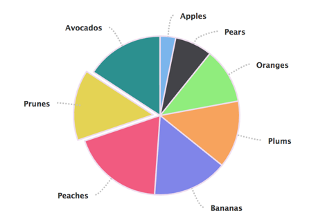
- Markup Details
-
                            {{ attach_library('goizueta_theme/stats-breaker') }}

<section class="stats-breaker">
  {% if background_image %}
    <div class="stats-breaker__bg-image">
      {{ background_image }}
    </div>
  {% endif %}
  <div class="stats-breaker__cards-wrapper">
    <ul class="stats-breaker__items">
      {% block card_item %}
      {% for item in items %}
        <li class="stats-breaker__item">
          {%
            include '@components/content-card/content-card.twig' with {
              "content_card": item.content_card
            } only
          %}
        </li>
      {% endfor %}
      {% endblock %}
    </ul>
  </div>
</section>
Sticky Container
This container has a sticky property. Applying the html stucture in the example file will allow items to stick.
- Markup Details
-
                            {{ attach_library('goizueta_theme/sticky-container') }}

<section class="sticky-container">
  <div class="sticky-container__inner">
    {{ content }}
  </div>
</section>
Superfilter
A Superfilter allows you to define a complex, tiered, dropdown checkbox filter.
- Markup Details
-
                            {{ attach_library('goizueta_theme/superfilter') }}
<div class="superfilter" id="superfilter-{{ filter.id }}">
  <section class="sticky-container wide">
    <div class="sticky-container__inner">
      <div class="superfilter__filter-section">
        <div class="filter-narrow">
          <div class="filter-narrow__trigger">
            <button class="filter-narrow__trigger-button"
              aria-controls="{{ filter.id ~ '-items-narrow' }}" aria-expanded="false">
              {{ filter.trigger.narrow.label }}
            </button>
          </div>
          {% if filter.inline_filters or filter.display_switcher.narrow %}
            <div class="filter-narrow__extra-options">
              {% if filter.inline_filters %}
                {% for inline_filter in filter.inline_filters %}
                <div class="filter__inline-filter filter-narrow__inline-filter">
                  <input type="checkbox" class="inline-filter-checkbox"
                    id="inline-filter-narrow-{{ inline_filter.key }}" value="{{ inline_filter.key }}"
                    {% if inline_filter.default %}checked{% endif %}/>
                  <label for="inline-filter-narrow-{{ inline_filter.key }}" class="option">
                    {{ inline_filter.value }}
                  </label>
                </div>
                {% endfor %}
              {% endif %}
              {% if filter.display_switcher.narrow %}
                {{ filter.display_switcher.narrow }}
              {% endif %}
            </div>
          {% endif %}
          <div class="filter-narrow__filter-items" id="{{ filter.id ~ '-items-narrow' }}" style="display: none" hidden>
            <div class="filter-narrow__filter-options">
              {% for section in filter.dropdown_sections %}
                <button class="filter-narrow__section-head{% if section.prefilter %} prefilter{% endif %}"
                  aria-controls="{{ filter.id ~ '-narrow-section-' ~ section.key }}" aria-expanded="false">
                  {{ section.title }}
                </button>
                <div class="filter-narrow__section-filters {% if section.prefilter %} prefilter{% endif %}"
                  id="{{ filter.id ~ '-narrow-section-' ~ section.key }}"
                  data-key="{{ section.key }}" style="display: none" hidden>
                  <ul class="superfilter-checkboxes">
                  {% for option in section.options %}
                    <li class="superfilter-checkbox">
                      <input type="checkbox" id="{{ filter.id ~ '-narrow-checkbox-' ~ option.key }}" value="{{ option.key }}"
                        {% if section.prefilter %}
                          disabled
                          {% if option.key in section.prefilter %}checked{% endif %}
                        {% endif %}
                        />
                      <label for="{{ filter.id ~ '-narrow-checkbox-' ~ option.key }}" class="option">
                        {{ option.value }}
                      </label>
                    </li>
                  {% endfor %}
                  </ul>
                </div>
              {% endfor %}
            </div>
            {% if filter.widgets.narrow.inside_bottom %}
              <div class="filter-narrow__inside-bottom">
                {% for widget in filter.widgets.narrow.inside_bottom %}
                  {{ widget }}
                {% endfor %}
              </div>
            {% endif %}
            <div class="filter-narrow__bottom">
              {% if filter.inline_filters %}
                {% for inline_filter in filter.inline_filters %}
                <div class="filter__inline-filter filter-narrow__inline-filter">
                  <input type="checkbox" class="inline-filter-checkbox"
                    id="inline-filter-narrow-bottom-{{ inline_filter.key }}" value="{{ inline_filter.key }}"
                    {% if inline_filter.default %}checked{% endif %}/>
                  <label for="inline-filter-narrow-bottom-{{ inline_filter.key }}" class="option">
                    {{ inline_filter.value }}
                  </label>
                </div>
                {% endfor %}
              {% endif %}
              <div class="filter-narrow__actions">
                <button class="filter-narrow__clear button button--light" type="button">
                  <div class="button--inner">
                    <span class="button__text">
                      {{ "Clear"|t }}
                    </span>
                  </div>
                </button>
                <button class="filter-narrow__apply button button--light" type="button">
                  <div class="button--inner">
                    <span class="button__text">
                      {{ "Apply"|t }}
                    </span>
                  </div>
                </button>
              </div>
            </div>
          </div>
        </div>
        <div class="filter-wide">
          <div class="filter-wide__trigger">
            <div class="filter-wide__trigger-legend">{{ filter.trigger.wide.label }}:</div>
            {% for section in filter.dropdown_sections %}
              <button class="filter-wide__dropdown-trigger button button--light{% if section.prefilter %} prefilter{% endif %}"
                aria-controls="filter-wide__dropdown" aria-expanded="false"
                {% if section.prefilter %}disabled{% endif %}
                >
                <div class="button--inner">
                  <span class="button__text">
                    {{ section.title }}
                  </span>
                </div>
              </button>
            {% endfor %}
            {% if filter.inline_filters %}
            <div class="filter-wide__inline">
              {% for inline_filter in filter.inline_filters %}
                <div class="filter__inline-filter filter-wide__inline-filter">
                  <input type="checkbox" class="inline-filter-checkbox"
                    id="inline-filter-wide-{{ inline_filter.key }}" value="{{ inline_filter.key }}"
                    {% if inline_filter.default %}checked{% endif %}/>
                  <label for="inline-filter-wide-{{ inline_filter.key }}" class="option">
                    {{ inline_filter.value }}
                  </label>
                </div>
                {% endfor %}
            </div>
          {% endif %}
          {% if filter.display_switcher.wide %}
            <div class="filter-wide__display-switcher">
              {{ filter.display_switcher.wide }}
            </div>
          {% endif %}
          </div>
          <div class="filter-wide__dropdown" style="display: none" hidden>
            <div class="filter-wide__dropdown-inner">
            {% for section in filter.dropdown_sections %}
              <div class="filter-wide__dropdown-section{% if section.prefilter %} prefilter{% endif %}" data-key="{{ section.key }}">
                <div class="section-legend">{{ section.title }}</div>
                <ul class="superfilter-checkboxes">
                {% for option in section.options %}
                  <li class="superfilter-checkbox">
                    <input type="checkbox" id="{{ filter.id ~ '-wide-checkbox-' ~ option.key }}" value="{{ option.key }}"
                      {% if section.prefilter %}
                        disabled
                        {% if option.key in section.prefilter %}checked{% endif %}
                      {% endif %}
                    />
                    <label for="{{ filter.id ~ '-wide-checkbox-' ~ option.key }}" class="option">
                      {{ option.value }}
                    </label>
                  </li>
                {% endfor %}
              </div>
            {% endfor %}
            </div>
            <button class="filter-wide__dropdown-close">
              <span class="sr-only">{{ "Close"|t }}</span>
            </button>
          </div>
        </div>
      </div>
    </div>
  </section>
  <div class="superfilter__content-section">
    {% if filter.widgets.narrow.content_top %}
      <div class="filter-narrow__content-top">
        {% for widget in filter.widgets.narrow.content_top %}
          {{ widget }}
        {% endfor %}
      </div>
    {% endif %}
    {% if filter.widgets.wide.content_top %}
      <div class="filter-wide__content-top">
        {% for widget in filter.widgets.wide.content_top %}
          {{ widget }}
        {% endfor %}
      </div>
    {% endif %}
    {{ content }}
  </div>
</div>
Switchpane
A mini-layout consisting of a div that switches between panes.
- Markup Details
-
                            {{ attach_library("goizueta_theme/switchpane") }}
<div class="switchpane" data-togglenarrow="{{ toggle_id_narrow }}"
  data-togglewide="{{ toggle_id_wide }}">
  {% for pane in panes %}
    {% set classes = "switchpane--pane switchpane--pane-" ~ loop.index %}
    {% if loop.index == 1 %}
      {% set classes = classes ~ " active" %}
    {% endif %}
    <div class="{{ classes }}">
      {{ pane }}
    </div>
  {% endfor %}
</div>
Tabbed Content
The Tabbed Content component is an accessible tabs solution.
Minority Tab Title
Fusce dapibus, tellus ac cursus commodo, tortor mauris condimentum nibh, ut fermentum massa justo sit amet risus. Sed posuere consectetur est at lobortis. Sed posuere consectetur est at lobortis. Vestibulum id ligula porta felis euismod semper.
Donec ullamcorper nulla non metus auctor fringilla. Aenean lacinia bibendum nulla sed consectetur. Duis mollis, est non commodo luctus, nisi erat porttitor ligula, eget lacinia odio sem nec elit. Donec id elit non mi porta gravida at eget metus. Cras mattis consectetur purus sit amet fermentum. Morbi leo risus, porta ac consectetur ac, vestibulum at eros.
Lorem ipsum dolor sit amet
Vestibulum maximus metus velit, vel laoreet felis auctor a. Aliquam consequat varius sapien non tempor. Nunc diam lorem, feugiat quis mauris nec, ullamcorper imperdiet tellus. Etiam eu magna posuere, laoreet nibh in, convallis massa. Praesent ut nulla vel augue ultricies molestie. Class aptent taciti sociosqu ad litora torquent per conubia nostra, per inceptos himenaeos. Maecenas mollis, felis non venenatis molestie, risus lectus condimentum arcu, gravida dignissim lacus nulla ut lectus. Cras eu justo non urna malesuada malesuada. Duis ante elit, consectetur eget risus quis, aliquet lobortis felis. Maecenas ac dui vel neque mattis egestas ut in arcu. Vivamus sed aliquet arcu.
- Markup Details
-
                            {{ attach_library('goizueta_theme/tabbed-content') }}

{# Preserve the Drupal attributes if they're available. #}
{%
  set attributes = attributes ? attributes.addClass('tabbed-content accessible-tabs') : ' class="tabbed-content accessible-tabs"'
%}
<section {{ attributes|raw }} aria-multiselectable="false">
  {% if tabbed_content.callout %}
    {% include '@components/text-breaker/text-breaker.twig' with tabbed_content.callout only %}
  {% endif %}
  {% if tabbed_content.tabs %}
    <nav class="tabbed-content__tabs accessible-tabs__navigation">
      <ul class="tabbed-content__tab-list" role="tablist">
        {% for tab in tabbed_content.tabs %}
          <li class="tabbed-content__tab-item{{ loop.index == 1 ? ' active' : '' }}" role="presentation" {{tab.attributes}} >
            <button
              class="tabbed-content__tab-label accessible-tabs__label"
              id="tab-label--{{ tabbed_content.instance }}--{{ loop.index }}"
              aria-controls="tab-panel--{{ tabbed_content.instance }}--{{ loop.index }}"
              aria-posinset="{{ loop.index }}"
              aria-setsize="{{ loop.length }}"
              aria-selected="{{ loop.index == 1 ? 'true' : 'false' }}"
              role="tab"
              tabindex="0"
            >
              {{ tab.tab_label }}
            </button>
          </li>
        {% endfor %}
      </ul>
    </nav>

    <div class="tabbed-content__panels">
      {% for content in tabbed_content.tabs %}
        <div
          class="tabbed-content__panel accessible-tabs__panel"
          id="tab-panel--{{ tabbed_content.instance }}--{{ loop.index }}"
          aria-hidden="{{ loop.index == 1 ? 'false' : 'true' }}"
          aria-labelledby="tab-label--{{ tabbed_content.instance }}--{{ loop.index }}"
          data-title="{{ content.tab_label }}"
          role="tabpanel"
          tabindex="-1"
        >
          <div class="tabbed-content__panel-container accessible-tabs__panel-container">
            {{ content.tab_panel }}
          </div>
        </div>
      {% endfor %}
    </div>
  {% endif %}
</section>
Tabbed Content with Callout
The Tabbed Content component is an accessible tabs solution. This example uses the callout component.
Minority Tab Title
Fusce dapibus, tellus ac cursus commodo, tortor mauris condimentum nibh, ut fermentum massa justo sit amet risus. Sed posuere consectetur est at lobortis. Sed posuere consectetur est at lobortis. Vestibulum id ligula porta felis euismod semper.
Donec ullamcorper nulla non metus auctor fringilla. Aenean lacinia bibendum nulla sed consectetur. Duis mollis, est non commodo luctus, nisi erat porttitor ligula, eget lacinia odio sem nec elit. Donec id elit non mi porta gravida at eget metus. Cras mattis consectetur purus sit amet fermentum. Morbi leo risus, porta ac consectetur ac, vestibulum at eros.
Lorem ipsum dolor sit amet
Vestibulum maximus metus velit, vel laoreet felis auctor a. Aliquam consequat varius sapien non tempor. Nunc diam lorem, feugiat quis mauris nec, ullamcorper imperdiet tellus. Etiam eu magna posuere, laoreet nibh in, convallis massa. Praesent ut nulla vel augue ultricies molestie. Class aptent taciti sociosqu ad litora torquent per conubia nostra, per inceptos himenaeos. Maecenas mollis, felis non venenatis molestie, risus lectus condimentum arcu, gravida dignissim lacus nulla ut lectus. Cras eu justo non urna malesuada malesuada. Duis ante elit, consectetur eget risus quis, aliquet lobortis felis. Maecenas ac dui vel neque mattis egestas ut in arcu. Vivamus sed aliquet arcu.
- Markup Details
-
{% include '@components/tabbed-content/tabbed-content.twig'%}
Text Breaker
The Text Breaker component is a collection of text fields such as eyebrow Heading and body text. It usually acts as a page breaker.
- Markup Details
-
                            {{ attach_library('goizueta_theme/text-breaker') }}

{%
  set attributes = attributes ? attributes.addClass('text-breaker') : ' class="text-breaker"'
%}

{% if eyebrow or heading or body_text %}
  <section{{ attributes|raw }}>
    {% if eyebrow %}
      {%
        include '@components/eyebrow/eyebrow.twig' with {
          "text": eyebrow
        } only
      %}
    {% endif %}

    {% if heading %}
      {%
        include '@components/heading/heading.twig' with {
          "heading": heading
        } only
      %}
    {% endif %}

    {% if body_text %}
      {%
        include '@components/body-text/body-text.twig' with {
          "body_text": body_text
        } only
      %}
    {% endif %}

  </section>
{% endif %}
Text List
The Text List component provides a list split in two columns. The list has a fixed height which when exceeded a collapsible fadede effect is shown to allow visitors to view/hide content.
- Thomas K. Amster 93MBA, Senior Managing Director at Macquarie Capital (Pacific Palisades, CA).
- Sarah Brow 89MBA, Global Account Director at the Coca-Cola Company (Marietta, GA).
- Nulla vitae elit libero, a pharetra augue. Aenean eu leo quam. Pellentesque ornare sem lacinia quam venenatis vestibulum. Curabitur blandit tempus porttitor.
- Sarah Brow 89MBA, Global Account Director at the Coca-Cola Company (Marietta, GA).
- Thomas K. Amster 93MBA, Senior Managing Director at Macquarie Capital (Pacific Palisades, CA).
- Nulla vitae elit libero, a pharetra augue. Aenean eu leo quam. Pellentesque ornare sem lacinia quam venenatis vestibulum. Curabitur blandit tempus porttitor.
- Sarah Brow 89MBA, Global Account Director at the Coca-Cola Company (Marietta, GA).
- Thomas K. Amster 93MBA, Senior Managing Director at Macquarie Capital (Pacific Palisades, CA).
- Nulla vitae elit libero, a pharetra augue. Aenean eu leo quam. Pellentesque ornare sem lacinia quam venenatis vestibulum. Curabitur blandit tempus porttitor.
- Sarah Brow 89MBA, Global Account Director at the Coca-Cola Company (Marietta, GA).
- Thomas K. Amster 93MBA, Senior Managing Director at Macquarie Capital (Pacific Palisades, CA).
- Nulla vitae elit libero, a pharetra augue. Aenean eu leo quam. Pellentesque ornare sem lacinia quam venenatis vestibulum. Curabitur blandit tempus porttitor.
- Sarah Brow 89MBA, Global Account Director at the Coca-Cola Company (Marietta, GA).
- Thomas K. Amster 93MBA, Senior Managing Director at Macquarie Capital (Pacific Palisades, CA).
- Nulla vitae elit libero, a pharetra augue. Aenean eu leo quam. Pellentesque ornare sem lacinia quam venenatis vestibulum. Curabitur blandit tempus porttitor.
- Sarah Brow 89MBA, Global Account Director at the Coca-Cola Company (Marietta, GA).
- Thomas K. Amster 93MBA, Senior Managing Director at Macquarie Capital (Pacific Palisades, CA).
- Nulla vitae elit libero, a pharetra augue. Aenean eu leo quam. Pellentesque ornare sem lacinia quam venenatis vestibulum. Curabitur blandit tempus porttitor.
- Sarah Brow 89MBA, Global Account Director at the Coca-Cola Company (Marietta, GA).
- Thomas K. Amster 93MBA, Senior Managing Director at Macquarie Capital (Pacific Palisades, CA).
- Nulla vitae elit libero, a pharetra augue. Aenean eu leo quam. Pellentesque ornare sem lacinia quam venenatis vestibulum. Curabitur blandit tempus porttitor.
- Sarah Brow 89MBA, Global Account Director at the Coca-Cola Company (Marietta, GA).
- Thomas K. Amster 93MBA, Senior Managing Director at Macquarie Capital (Pacific Palisades, CA).
- Nulla vitae elit libero, a pharetra augue. Aenean eu leo quam. Pellentesque ornare sem lacinia quam venenatis vestibulum. Curabitur blandit tempus porttitor.
- Sarah Brow 89MBA, Global Account Director at the Coca-Cola Company (Marietta, GA).
- Thomas K. Amster 93MBA, Senior Managing Director at Macquarie Capital (Pacific Palisades, CA).
- Nulla vitae elit libero, a pharetra augue. Aenean eu leo quam. Pellentesque ornare sem lacinia quam venenatis vestibulum. Curabitur blandit tempus porttitor.
- Sarah Brow 89MBA, Global Account Director at the Coca-Cola Company (Marietta, GA).
- Thomas K. Amster 93MBA, Senior Managing Director at Macquarie Capital (Pacific Palisades, CA).
- Nulla vitae elit libero, a pharetra augue. Aenean eu leo quam. Pellentesque ornare sem lacinia quam venenatis vestibulum. Curabitur blandit tempus porttitor.
- Sarah Brow 89MBA, Global Account Director at the Coca-Cola Company (Marietta, GA).
- Thomas K. Amster 93MBA, Senior Managing Director at Macquarie Capital (Pacific Palisades, CA).
- Markup Details
-
                            {{ attach_library('goizueta_theme/text-list') }}
{% import '@components/icons/icons.twig' as icons %}

{% set component_classes = ['text-list', 'show-more-content'] %}
{%
  set attributes = attributes ? attributes.addClass(component_classes) : ' class="' ~ component_classes|join(' ') ~ '"'
%}

<section{{ attributes|raw }}>
  {% if heading %}
    {%
      include '@components/heading/heading.twig' with {
        "heading": heading
      } only
    %}
  {% endif %}
  <div class="text-list__list--wrapper">
    {% block text_list_content %}
      <ul class="text-list__list">
        {% for item in items %}
          <li class="text-list__item">
            {{ item.board_member }}
          </li>
        {% endfor %}
      </ul>
    {% endblock %}
  </div>
  <div class="text-list__cta--wrapper">
    <button
      class="text-list__show-more--btn js-text-list__show-more"
      aria-expanded="false">
        <span class="visually-hidden">
          {{ 'Toggle text'|t }}
        </span>
        {{ icons.get('arrow-left', 'icon--toggle-icon') }}
    </button>
  </div>
</section>
Timeline Card
The Timeline Card has two variants:
Image only, that usually describes a change in season.
Image and copy, these are used as points on the timeline.

This is the title
- Markup Details
-
                            {{ attach_library('goizueta_theme/timeline-card') }}


{%
  set attributes = attributes ? attributes.addClass('timeline-card') : ' class="timeline-card"'
%}

<article {{ attributes|raw }}>
  <div class="timeline-card__inner {{season_class}}">
  {% if type == 'breaker' %}
    <div class="timeline-card__breaker">
    {% include '@components/heading/heading.twig' with {
       "heading" : {
          "title_light": heading.title_light,
          "title_heavy": heading.title_heavy,
          "url": heading.url,
          "heading_level": "3",
          "classes": heading.classes
        }
      } only %}
    </div>
  {% else %}
    {% if image %}
      <div class="timeline-card__image--container">
        {{ image }}
      </div>
    {% endif %}
    <div class="timeline-card-content__container {{ program_class }} {% if image %}with-image{% else %}no-image{% endif %}">
      <div class="timeline-card__eyebrow">
        {% include '@components/heading/heading.twig' with {
          "heading" : {
            "title_light": heading.title_light,
            "title_heavy": heading.title_heavy,
            "url": heading.url,
            "heading_level": "4",
            "classes": heading.classes
          }
        } only %}
      </div>
      <div class="timeline-card-content__inner">
        <h5 class="timeline-card-content__title">{{ title }}</h5>
        <div class="timeline-card-content__text-container">
          {{ body }}
        </div>
        <a class="timeline-card-content__link" href="{{ link.url }}"> {{ link.text }}</a>
      </div>
    </div>
    {% endif %}
  </div>
</article>
Timeline Container
The Timeline Card has two variants:
Image only, that usually describes a change in season.
Image and copy, these are used as points on the timeline.
We are using the MIT license version of WOW.js.
https://github.com/graingert/WOW/
We are also using the animate css library from:
https://daneden.github.io/animate.css/
The settings for the wow library are defined in this components
js file.
Current settings are boxClass: 'timeline-comtainer__card', offset: 100
The docs for these are here: https://wowjs.uk/docs.html
100 years Of Impact
-
-
This is the title
Donec sed odio operae, eu vulputate felis rhoncus. Inmensae subtilitatis, obscuris et malesuada fames.this is the link text -
This is the title
Donec sed odio operae, eu vulputate felis rhoncus. Inmensae subtilitatis, obscuris et malesuada fames.this is the link text -
This is the title
Donec sed odio operae, eu vulputate felis rhoncus. Inmensae subtilitatis, obscuris et malesuada fames.this is the link text -
This is the title
Donec sed odio operae, eu vulputate felis rhoncus. Inmensae subtilitatis, obscuris et malesuada fames.this is the link text -
-
This is the title
Donec sed odio operae, eu vulputate felis rhoncus. Inmensae subtilitatis, obscuris et malesuada fames.this is the link text -
This is the title
Donec sed odio operae, eu vulputate felis rhoncus. Inmensae subtilitatis, obscuris et malesuada fames.this is the link text -
This is the title
Donec sed odio operae, eu vulputate felis rhoncus. Inmensae subtilitatis, obscuris et malesuada fames.this is the link text -
This is the title
Donec sed odio operae, eu vulputate felis rhoncus. Inmensae subtilitatis, obscuris et malesuada fames.this is the link text
-
-
This is the title
Donec sed odio operae, eu vulputate felis rhoncus. Inmensae subtilitatis, obscuris et malesuada fames.this is the link text -
This is the title
Donec sed odio operae, eu vulputate felis rhoncus. Inmensae subtilitatis, obscuris et malesuada fames.this is the link text -
This is the title
Donec sed odio operae, eu vulputate felis rhoncus. Inmensae subtilitatis, obscuris et malesuada fames.this is the link text -
This is the title
Donec sed odio operae, eu vulputate felis rhoncus. Inmensae subtilitatis, obscuris et malesuada fames.this is the link text -
-
This is the title
Donec sed odio operae, eu vulputate felis rhoncus. Inmensae subtilitatis, obscuris et malesuada fames.this is the link text -
This is the title
Donec sed odio operae, eu vulputate felis rhoncus. Inmensae subtilitatis, obscuris et malesuada fames.this is the link text -
This is the title
Donec sed odio operae, eu vulputate felis rhoncus. Inmensae subtilitatis, obscuris et malesuada fames.this is the link text -
This is the title
Donec sed odio operae, eu vulputate felis rhoncus. Inmensae subtilitatis, obscuris et malesuada fames.this is the link text
-
-
This is the title
Donec sed odio operae, eu vulputate felis rhoncus. Inmensae subtilitatis, obscuris et malesuada fames.this is the link text -
This is the title
Donec sed odio operae, eu vulputate felis rhoncus. Inmensae subtilitatis, obscuris et malesuada fames.this is the link text -
This is the title
Donec sed odio operae, eu vulputate felis rhoncus. Inmensae subtilitatis, obscuris et malesuada fames.this is the link text -
This is the title
Donec sed odio operae, eu vulputate felis rhoncus. Inmensae subtilitatis, obscuris et malesuada fames.this is the link text -
-
This is the title
Donec sed odio operae, eu vulputate felis rhoncus. Inmensae subtilitatis, obscuris et malesuada fames.this is the link text -
This is the title
Donec sed odio operae, eu vulputate felis rhoncus. Inmensae subtilitatis, obscuris et malesuada fames.this is the link text -
This is the title
Donec sed odio operae, eu vulputate felis rhoncus. Inmensae subtilitatis, obscuris et malesuada fames.this is the link text -
This is the title
Donec sed odio operae, eu vulputate felis rhoncus. Inmensae subtilitatis, obscuris et malesuada fames.this is the link text
- Markup Details
-
                            {{ attach_library('goizueta_theme/timeline-container') }}

{%
  set attributes = attributes ? attributes.addClass('timeline-container') : ' class="timeline-container"'
%}

<section {{ attributes|raw }}>
  <div class="timeline-container__header">
    <div class="timeline-container__program-title">
      {{ program_title }}
    </div>
    {% include '@components/heading/heading.twig' with {
      "heading" : {
        "title_light": heading.title_light,
        "title_heavy": heading.title_heavy,
        "url": heading.url,
        "heading_level": "2",
        "classes": heading.classes
      }
    } only %}
  </div>
  <div class="timeline-container__text">
    {{ program_text }}
  </div>
  <button class="timeline-container__reveal" aria-label="reveal the timeline">
    <svg xmlns="http://www.w3.org/2000/svg" viewBox="0 0 27.6 28.4">
      <style>.circleFill{fill:#185785}</style>
      <path class="circleFill" d="M7.7 11.3c-.2.2-.2.6 0 .9.2.2.6.2.9 0l4.5-4.5v14.8c0 .3.3.6.6.6s.6-.3.6-.6V7.7l4.5 4.5c.2.2.6.2.9 0 .2-.2.2-.6 0-.9l-5.5-5.5c-.2-.2-.6-.2-.9 0l-5.6 5.5z"/><path class="circleFill" d="M13.7 27C6.7 27 1 21.3 1 14.3c0-7 5.7-12.8 12.8-12.8 7 0 12.7 5.7 12.7 12.8 0 7-5.8 12.7-12.8 12.7zm0-24.5C7.2 2.5 2 7.8 2 14.3 2 20.8 7.2 26 13.7 26s11.7-5.3 11.7-11.8c.1-6.4-5.2-11.7-11.7-11.7z"/><path class="circleFill" d="M-136.3-241c-.2-.2-.6-.2-.9 0-.2.2-.2.6 0 .9l4.5 4.5h-14.8c-.3 0-.6.3-.6.6s.3.6.6.6h14.8l-4.5 4.5c-.2.2-.2.6 0 .9.2.2.6.2.9 0l5.5-5.5c.2-.2.2-.6 0-.9l-5.5-5.6z"/>
    </svg>
  </button>
  <div class="timeline-container__program-title js-open-time">
    {{ program_title }}
  </div>
  <div class="timeline-container__revealer js-open-time">
    <div class="timeline-container__animation-control" aria-label="Content animates in, to view content without motion uncheck box.">
      <div class="checkbox row">
        <input id="toggle_off" class="timeline-container__toggle" checked type="checkbox" name="animation_value" value="toggle_off">
        <label for="toggle_off">Display content with animation</label>
      </div>
    </div>
    <div class="timeline-container__tabs-section">
      {% if timelines|length > 1 %}
        {% for item in timelines %}
          {% if item.title %}
            <div class="timeline-container__duration-cont">
              <button class="timeline-container__duration{% if loop.first %} js-active{% endif %}" data-duration="{{item.title}}">
                {{ item.title }}
              </button>
              <div class="timeline-container__duration-text">
                {{ item.sub_text }}
              </div>
            </div>
          {% endif %}
        {% endfor %}
      {% endif %}
    </div>
    {% for item in timelines %}
      <ul class="timeline-container__cards {{item.title}} {% if loop.index >1%} js-timeline-hide{% endif %}" data-duration="{{item.title}}">
        {% for card in item.timeline_items %}
          <li class="timeline-container__card fadeInLeftBig">
            {% include '@components/timeline-card/timeline-card.twig' with card only %}
          </li>
        {% endfor %}
      </ul>
    {% endfor %}
  </div>
</section>
Toggle Buttons
A panel of toggle buttons with icons.
- Markup Details
-
                            {{ attach_library('goizueta_theme/toggle-buttons') }}
<div class="toggle-buttons" id="{{ id }}">
  {% for button in buttons %}
  <div class="toggle-button-wrapper">
    <style>
      #{{ button.id }} {
        background-size: {{ button.background_size }};
        background-image: {{ button.background_image }};
      }
      #{{ button.id }}.active {
        background-image: {{ button.background_image_active }};
      }
      }
    </style>
    {% set button_class = button.classes ? "toggle-button " ~ button.classes : "toggle-button" %}
    <button id="{{ button.id }}" class="{{ button_class }}" title="{{ button.title }}"
      data-delta="{{ loop.index }}"
      name="{{ button.name }}" aria-label="{{ button.label }}"></button>
  </div>
  {% endfor %}
</div>
Utility Bar
This is the Utility Bar used as the site's branding.
- Markup Details
-
                            {{ attach_library('goizueta_theme/utility-bar') }}
{% import '@components/icons/icons.twig' as icons %}

{# Preserve the Drupal attributes if they're available. #}
{%
  set attributes = attributes ? attributes.addClass('utility-bar') : ' class="utility-bar"'
%}
<div{{ attributes|raw }}>
  <div class="utility-bar__inner" >
    {% if secondary_nav %}
      {%
        include '@components/site-search/site-search.twig' with {
          "label": site_search.label,
          "placeholder": site_search.placeholder
        } only
      %}
    {% endif %}
    <div class="utility-bar--nav-search">
      <div class="utility-bar--logo">
        <a href="{{ url('<front>') }}">
          <img src="{{ theme_path }}/dist/assets/emory-white-shield.png"
               alt="{{ site_name }}" />
        </a>
      </div>
      {% if secondary_nav %}
        {%
          include '@components/secondary-nav/secondary-nav.twig' with {
            "items": secondary_nav
          } only
        %}
      {% endif %}
      {% if site_search %}
        <button
          class="site-search__btn js-search-toggle"
          aria-expanded="false">
          <span class="visually-hidden">Search</span>
          {{ icons.get('search', 'icon--search') }}
        </button>
      {% endif %}
      <div class="utility-bar--menu" role="button" aria-haspopup="true" class="mega-menu__toggle menu-toggle" aria-expanded="false">
        <div class="mega-menu__toggle--wrapper">
          <span class="toggle-text">MENU</span>
          <button class="main-menu__toggle" aria-controls="main menu open close" aria-label="Main menu open button" tabindex="0">
            <div class="main-menu__control">
              <span></span>
              <span></span>
              <span></span>
              <span></span>
              <span></span>
              <span></span>
            </div>
          </button>
        </div>
      </div>
    </div>
  </div>
</div>
Variable Content Carousel Container
Variable Content Carousel Container is a carousel.
The slide items are Variable Content Carousel Items.
- Markup Details
-
                            {{ attach_library('goizueta_theme/variable-content-carousel-container') }}
{% set item_count = variable_content_carousel_container.variable_content_carousel_items|length %}

<section class="variable-content-carousel-container {% if item_count > 4 %} hide-dots--mobile{% endif %}">
  {% if variable_content_carousel_container.sub_heading %}
    <div class="variable-content-carousel-container__sub-heading">
      <p>{{ variable_content_carousel_container.sub_heading }}</p>
    </div>
  {% endif %}

  {% if variable_content_carousel_container.heading %}
    <div class="variable-content-carousel-container__heading">
      {% include '@components/heading/heading.twig' with {
        "heading" : variable_content_carousel_container.heading
      } only %}
    </div>
  {% endif %}

  <div class="variable-content-carousel-container__slick splide">
    <div class="splide__track">
      <ul class="splide__list">
        {% for item in variable_content_carousel_container.variable_content_carousel_items %}
          <li class="splide__slide">
            {% include '@components/variable-content-carousel-item/variable-content-carousel-item.twig' with {
              "variable_content_carousel_item" : item.variable_content_carousel_item
            } only %}
          </li>
        {% endfor %}
      </ul>
    </div>

    {# This is used as a container for splide's arrows and pagination. #}
    <div class="variable-content-carousel-container__pager splide__arrows">
      <ul class="splide__pagination"></ul>
    </div>
  </div>
</section>
Variable Content Carousel Item
The Variable Content Carousel Item is displayed within
a Variable Content Carousel Container.
Goizueta Impact Investing Club
Sub Head
- Markup Details
-
                            {{ attach_library('goizueta_theme/variable-content-carousel-item') }}

{# Preserve the Drupal attributes if they're available. #}
{% set component_classes = 'variable-content-carousel-item' %}
{% set attributes = attributes ? attributes.addClass(component_classes) : ' class="' ~ component_classes ~ '"' %}
{% import '@components/icons/icons.twig' as icons %}

<article {{ attributes|raw }}>
  {% if variable_content_carousel_item.heading %}
    <div class="variable-content-carousel-item__title">
      {%
        include '@components/heading/heading.twig' with {
          "heading" : variable_content_carousel_item.heading
        } only
      %}
    </div>
  {% endif %}

  {% if variable_content_carousel_item.image %}
    <div class="variable-content-carousel-item__image">
      {{ variable_content_carousel_item.image }}
    </div>
  {% elseif variable_content_carousel_item.video %}
    <div class="variable-content-carousel-item__image">
      <a href="{{ variable_content_carousel_item.video.url }}" class="variable-content-carousel-item__video-link" data-lity aria-label="Link to open video">
        {{ variable_content_carousel_item.video.poster }}
        <span class="variable-content-carousel-item__icon-wrapper">
          {{ icons.get('play', 'spotlight__play-icon') }}
        </span>
      </a>
    </div>
  {% endif %}


    <div class="variable-content-carousel-item__text">
      {% if variable_content_carousel_item.eyebrow %}
        <div class="eyebrow">
          {{ variable_content_carousel_item.eyebrow }}
        </div>
      {% endif %}
      {% if variable_content_carousel_item.sub_heading %}
        {% include '@components/heading/heading.twig' with {
          "heading" : variable_content_carousel_item.sub_heading
        } only %}
      {% endif %}
      {% if variable_content_carousel_item.text %}
        {{ variable_content_carousel_item.text }}
      {% endif %}
    </div>


  {% if variable_content_carousel_item.button %}
    <div class="variable-content-carousel-item__button">
      {%
        include '@components/button/button.twig' with {
          "button": {
            "text": variable_content_carousel_item.button.text,
            "url": variable_content_carousel_item.button.url,
            "icon": variable_content_carousel_item.button.icon,
          }
        } only
      %}
    </div>
  {% endif %}
</article>
Venn Diagram
Displays images and text in the form of a 3-circle Venn Diagram.
-
Goizueta Full-Time MBA
Our One-Year MBA experience honors the man we are named for...
-
World-Class Business Education
Not only will you learn from world renowned faculty but you...
-
Intimate Learning Environment
Goizueta is small by desgin and desgined to be small...
-
Dynamic, Global City
Pursuing your Goizueta MBA means access to all Atlanta has to offer...
-
Education Made Personal
Lorem ipsum dolor sit amet adipiscing
-
Career Launchpad
Lorem ipsum dolor sit amet adipiscing
-
Opportunities Abound
Lorem ipsum dolor sit amet adipiscing
-
The Goizueta Effect
Your time in this program is about growing as a person,...
- Markup Details
-
                            {{ attach_library('goizueta_theme/venn') }}

{# Preserve the Drupal attributes if they're available. #}
{% set component_classes = 'venn' %}
{% set attributes = attributes ? attributes.addClass(component_classes) : ' class="' ~ component_classes ~ '"' %}

<article {{ attributes|raw }}>
  <div class="venn__diagram" id="{{ safe_id }}"
       data-c1_fg_color="{{ c1_fg_color }}"
       data-c1_bg_color="{{ c1_bg_color }}"
       data-c2_fg_color="{{ c2_fg_color }}"
       data-c2_bg_color="{{ c2_bg_color }}"
       data-c3_fg_color="{{ c3_fg_color }}"
       data-c3_bg_color="{{ c3_bg_color }}"
       data-safe_id_c1="{{ safe_id_c1 }}"
       data-safe_id_c2="{{ safe_id_c2 }}"
       data-safe_id_c3="{{ safe_id_c3 }}"
       data-safe_id_c1_c2="{{ safe_id_c1_c2 }}"
       data-safe_id_c2_c3="{{ safe_id_c2_c3 }}"
       data-safe_id_c1_c3="{{ safe_id_c1_c3 }}"
       data-safe_id_all="{{ safe_id_all }}"
       data-state="initial"
  >
    <svg viewBox="0 0 100 100">
      <defs>
        <pattern id="{{ safe_id_c1 }}" patternUnits="userSpaceOnUse"
                 width="100" height="100">
          <image href="{{ c1_hover_img_url }}" x="20" y="4" width="60" height="60" />
        </pattern>
        <pattern id="{{ safe_id_c2 }}" patternUnits="userSpaceOnUse"
                 width="100" height="100">
          <image href="{{ c2_hover_img_url }}" x="0" y="35" width="60" height="60" />
        </pattern>
        <pattern id="{{ safe_id_c3 }}" patternUnits="userSpaceOnUse"
                 width="100" height="100">
          <image href="{{ c3_hover_img_url }}" x="37" y="35" width="60" height="60" />
        </pattern>
        <pattern id="{{ safe_id_c1_c2 }}" patternUnits="userSpaceOnUse"
                 width="100" height="100">
          <image href="{{ c1_c2_hover_img_url }}" x="0" y="0" width="80" height="100" />
        </pattern>
        <pattern id="{{ safe_id_c2_c3 }}" patternUnits="userSpaceOnUse"
                 width="100" height="100">
          <image href="{{ c2_c3_hover_img_url }}" x="0" y="35" width="100" height="60" />
        </pattern>
        <pattern id="{{ safe_id_c1_c3 }}" patternUnits="userSpaceOnUse"
                 width="100" height="100">
          <image href="{{ c1_c3_hover_img_url }}" x="20" y="0" width="80" height="100" />
        </pattern>
        <pattern id="{{ safe_id_all }}" patternUnits="userSpaceOnUse"
                 width="100" height="100">
          <image href="{{ all_hover_img_url }}" x="0" y="0" width="100" height="100" />
        </pattern>
      </defs>
      <g class="venn__group_c1_c2" fill="transparent">
        <circle cx="50" cy="34" r="30" />
        <circle cx="32" cy="65" r="30" />
      </g>
      <g class="venn__group_c2_c3" fill="transparent">
        <circle cx="32" cy="65" r="30" />
        <circle cx="67" cy="65" r="30" />
      </g>
      <g class="venn__group_c1_c3" fill="transparent">
        <circle cx="50" cy="34" r="30" />
        <circle cx="67" cy="65" r="30" />
      </g>
      <g class="venn__group_all" fill="transparent">
        <circle cx="50" cy="34" r="30" />
        <circle cx="32" cy="65" r="30" />
        <circle cx="67" cy="65" r="30" />
      </g>
      <circle class="venn__c1" cx="50" cy="34" r="30"
              cursor="pointer" pointer-events="visible"
              stroke="transparent" stroke-width="0.25" fill="{{ c1_bg_color }}" />
      <circle class="venn__c2" cx="32" cy="65" r="30"
              cursor="pointer" pointer-events="visible"
              stroke="transparent" stroke-width="0.25" fill="{{ c2_bg_color }}" />
      <circle class="venn__c3" cx="67" cy="65" r="30"
              cursor="pointer" pointer-events="visible"
              stroke="transparent" stroke-width="0.25" fill="{{ c3_bg_color }}" />
    </svg>
    <div class="c1-title" style="color: {{ c1_fg_color }}">{{ c1_title }}</div>
    <div class="c2-title" style="color: {{ c2_fg_color }}">{{ c2_title }}</div>
    <div class="c3-title" style="color: {{ c3_fg_color }}">{{ c3_title }}</div>
  </div>
  <div class="venn__text">
    <ul class="venn__text-list">
      <li class="initial-text active">
        {{ initial_text }}
      </li>
      <li class="c1-text">
        {{ c1_text }}
      </li>
      <li class="c2-text">
        {{ c2_text }}
      </li>
      <li class="c3-text">
        {{ c3_text }}
      </li>
      <li class="c1-c2-text">
        {{ c1_c2_text }}
      </li>
      <li class="c1-c3-text">
        {{ c1_c3_text }}
      </li>
      <li class="c2-c3-text">
        {{ c2_c3_text }}
      </li>
      <li class="all-text">
        {{ all_text }}
      </li>
    </ul>
    <a class="venn__cycle" href="#">{{ "Display next"|trans }}</a>
  </div>
</article>